Project Credits & Specs:
- Design Company: WJ STUDIO
- Design Director: Hu Zhile
- Design Team: Yang Xi, Zhu Chenshaohua, Yang Lilian, He Guofang
- Photography: Zhang Xi
- Location: Yiwu, Zhejiang, China
- Area: 200 m2
- Year: 2022

Design thinking based on the business world
Yiwu is located in Zhejiang Province, the geographical center of Hangzhou, Ningbo, and Jinhua, with intensive exchanges with other cities in Zhejiang. EQUATOR PEAK COFFEE is in the center of Yiwu, with easy access to the city and a riverside view. It is close to Wanda Plaza and high-end residential areas, with a stable audience with a certain level of purchasing power.
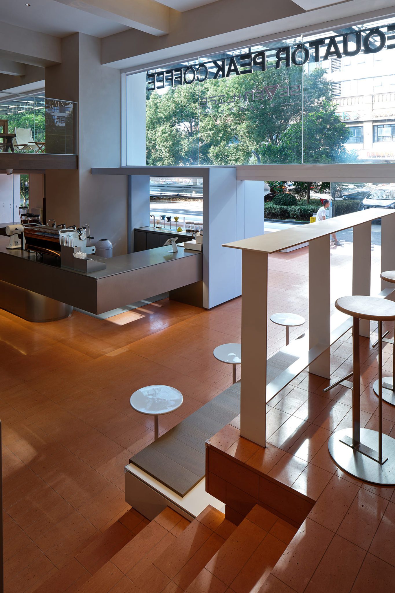
The architect tries to present and explore the relationship between the building and the city through visual extension.
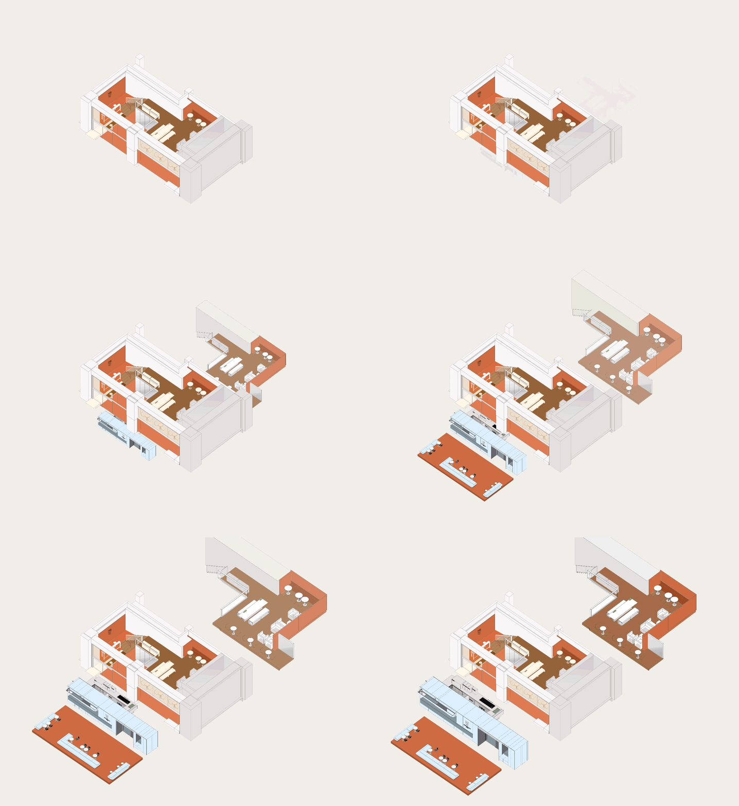
As a downtown area with a high level of commercial traffic, it also seems to be in desperate need of a little respite, a place to stop and rest, relax and chat with others, or take a shallow moment of leisure amid the bustling city.
About coffee — a medium of interaction between interior and exterior
In the past, our impression of coffee shops seemed stuck in the following two stages: the earliest buy-it-and-go pure coffee sales, or the coffee-based lifestyle, as exemplified by Starbucks. These two models, whether in operation methods or interior design, both emphasize the private sphere to a greater or lesser extent. They are highly inward-looking and private to consumers.
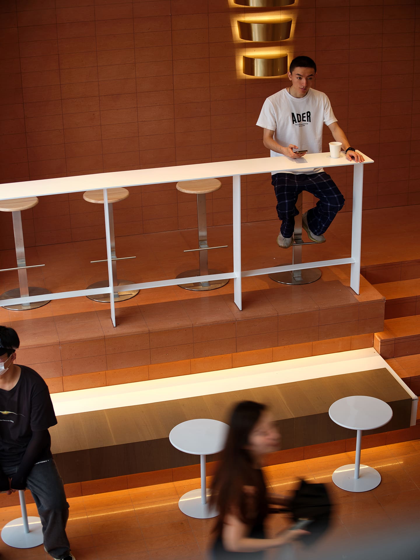
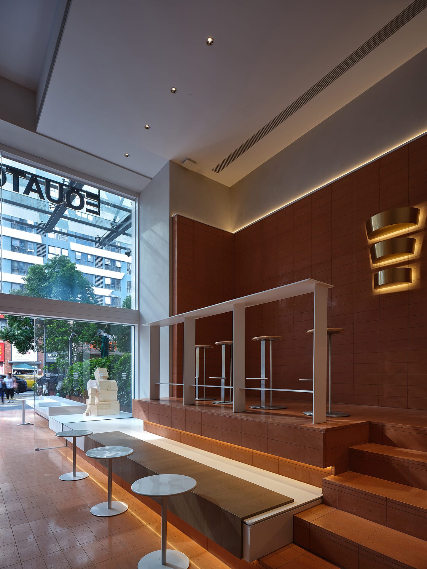
What EQUATOR PEAK COFFEE wants to create is a new type of social cafe, perhaps to reflect the growing need for social interaction or perhaps to project this need into the design of the space.
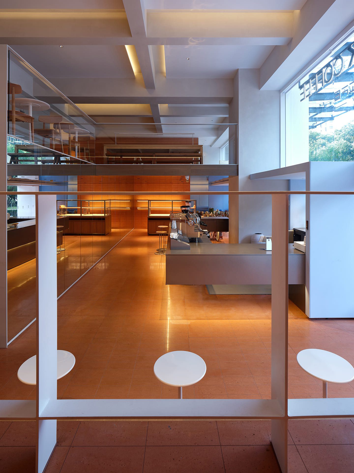
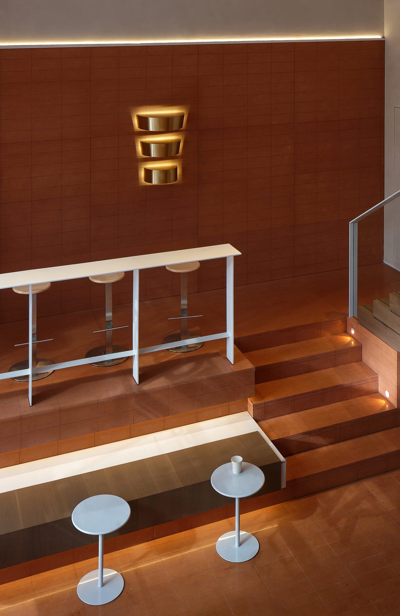
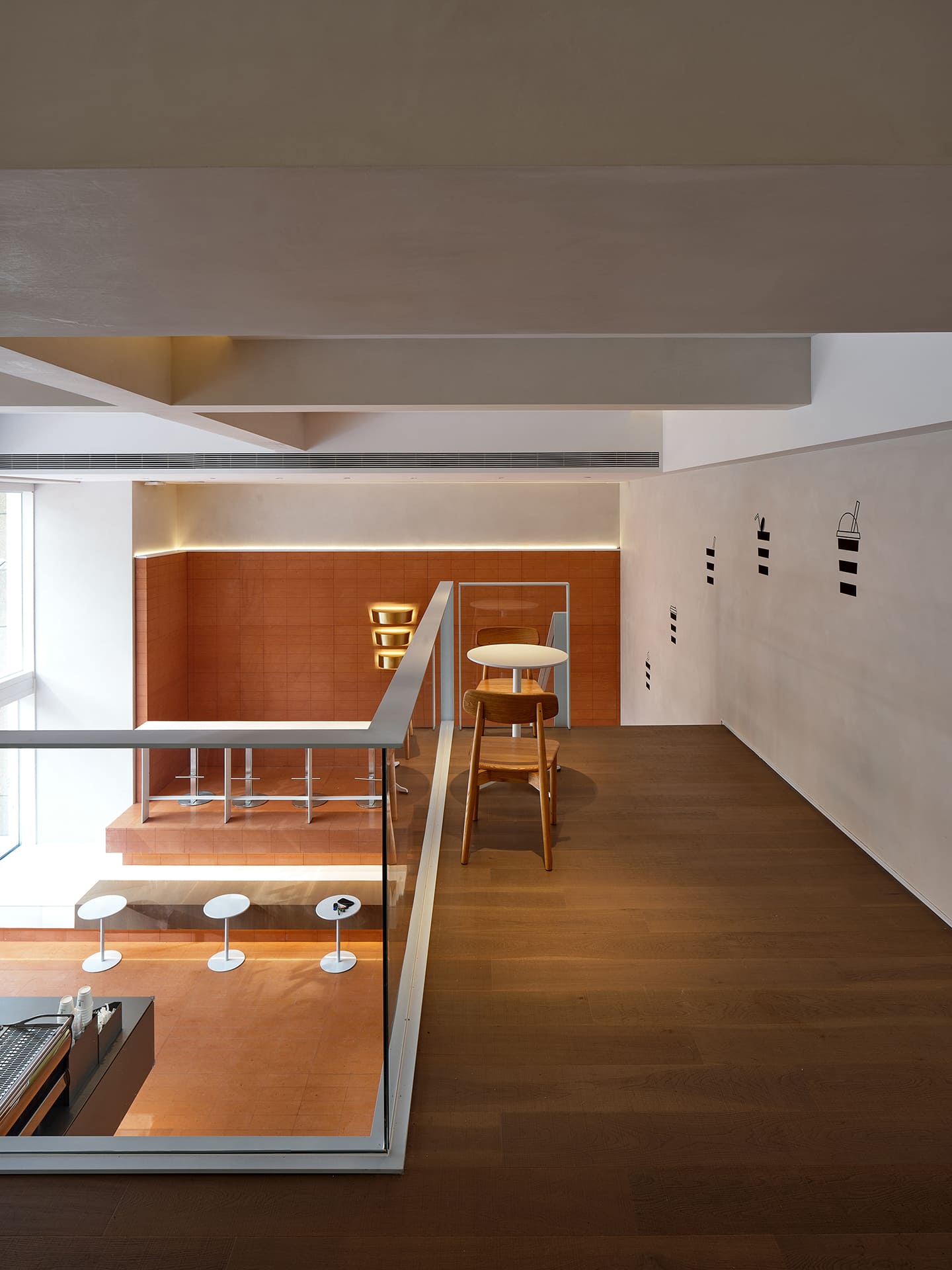
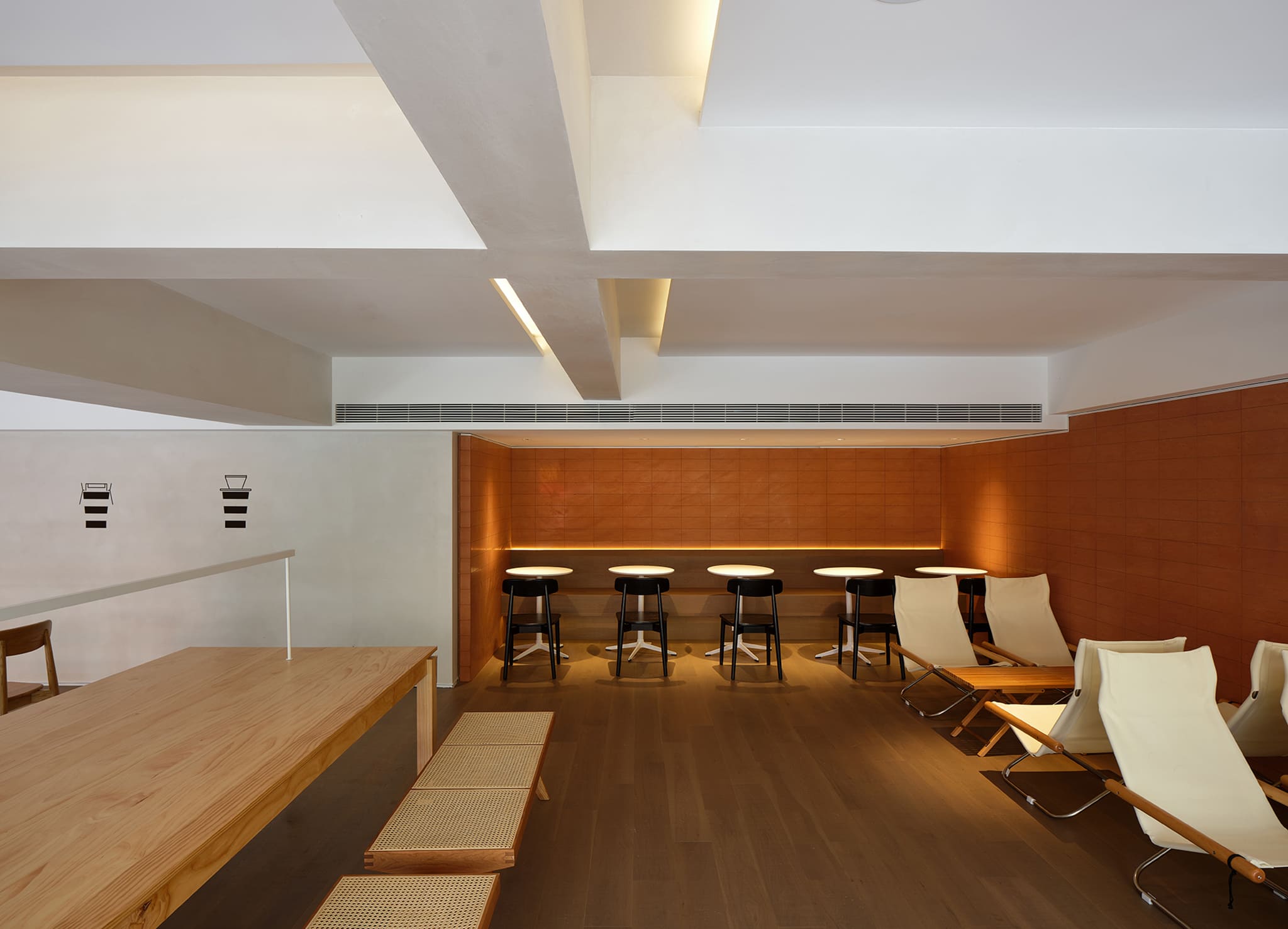
Lefebvre considered the concept of space dialectically, as both objective and subjective, subservient to its physical characteristics and derived from the social properties of its use.
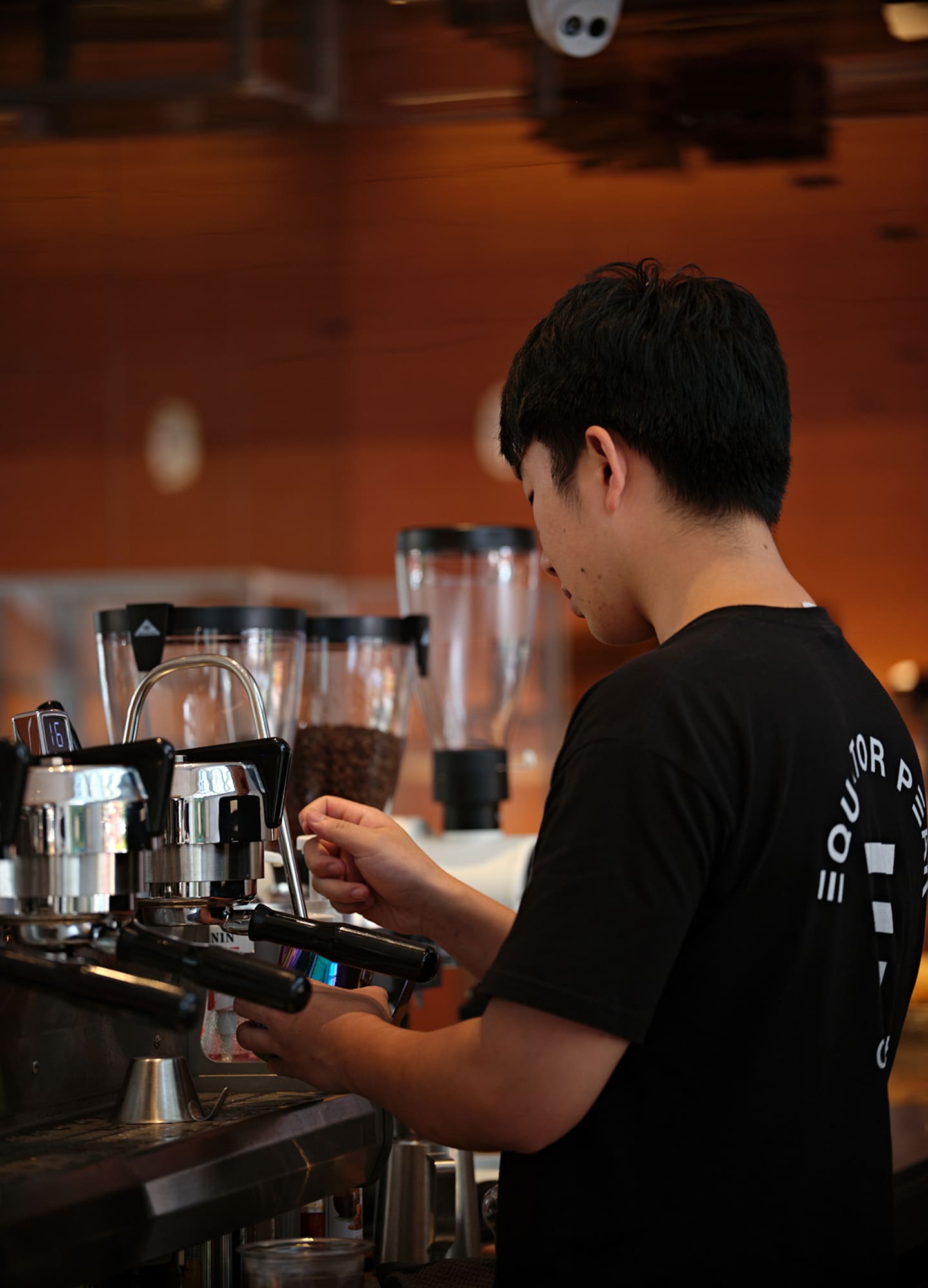
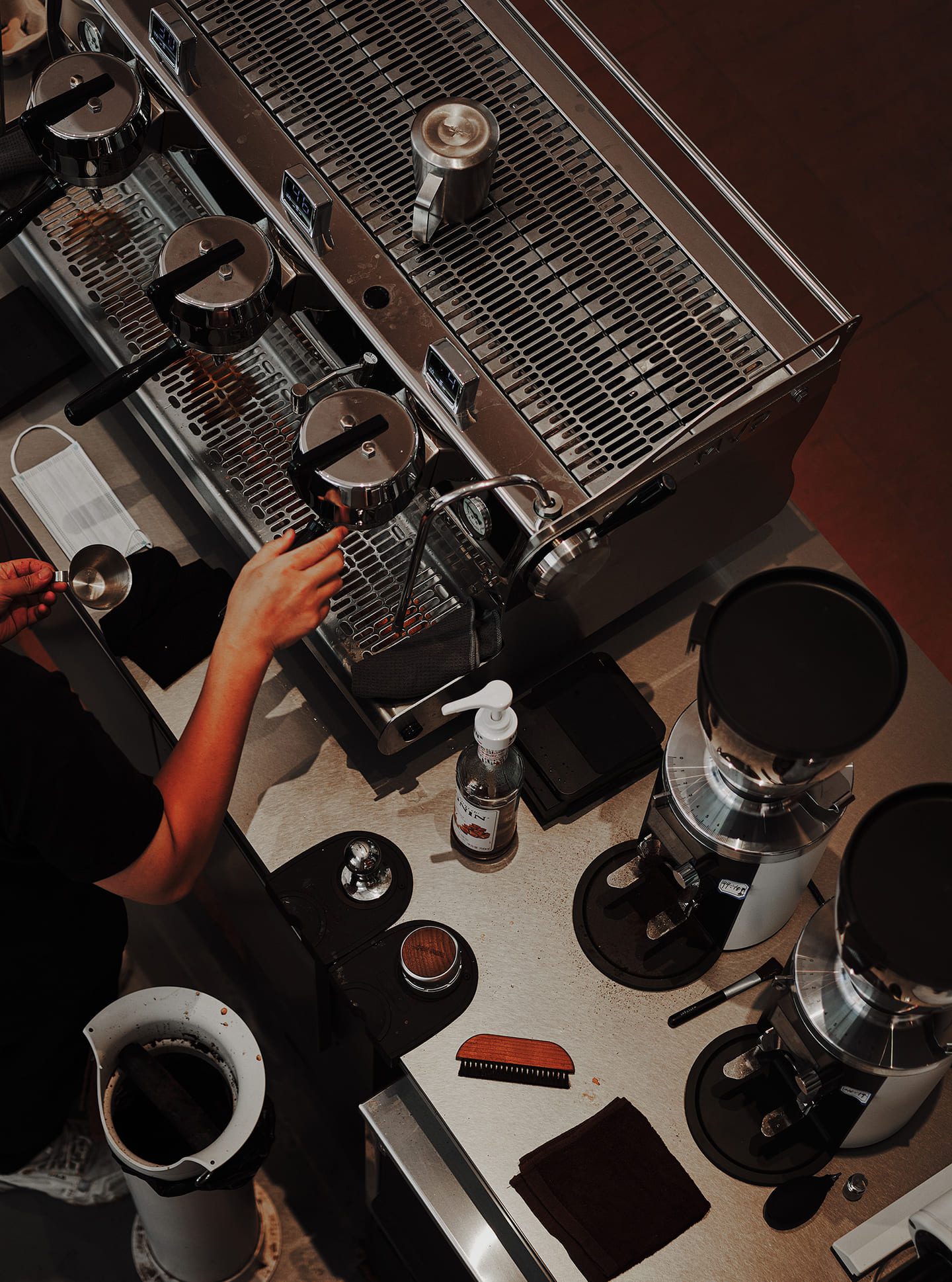
Interestingly, the ‘cafè’ is seen as a social medium, expanding from the interior to the exterior, transforming from inward to outward-looking. The design is also a metaphor for the increasing social demands of society, with coffee or coffee shops now becoming a figurative expression of social interaction.
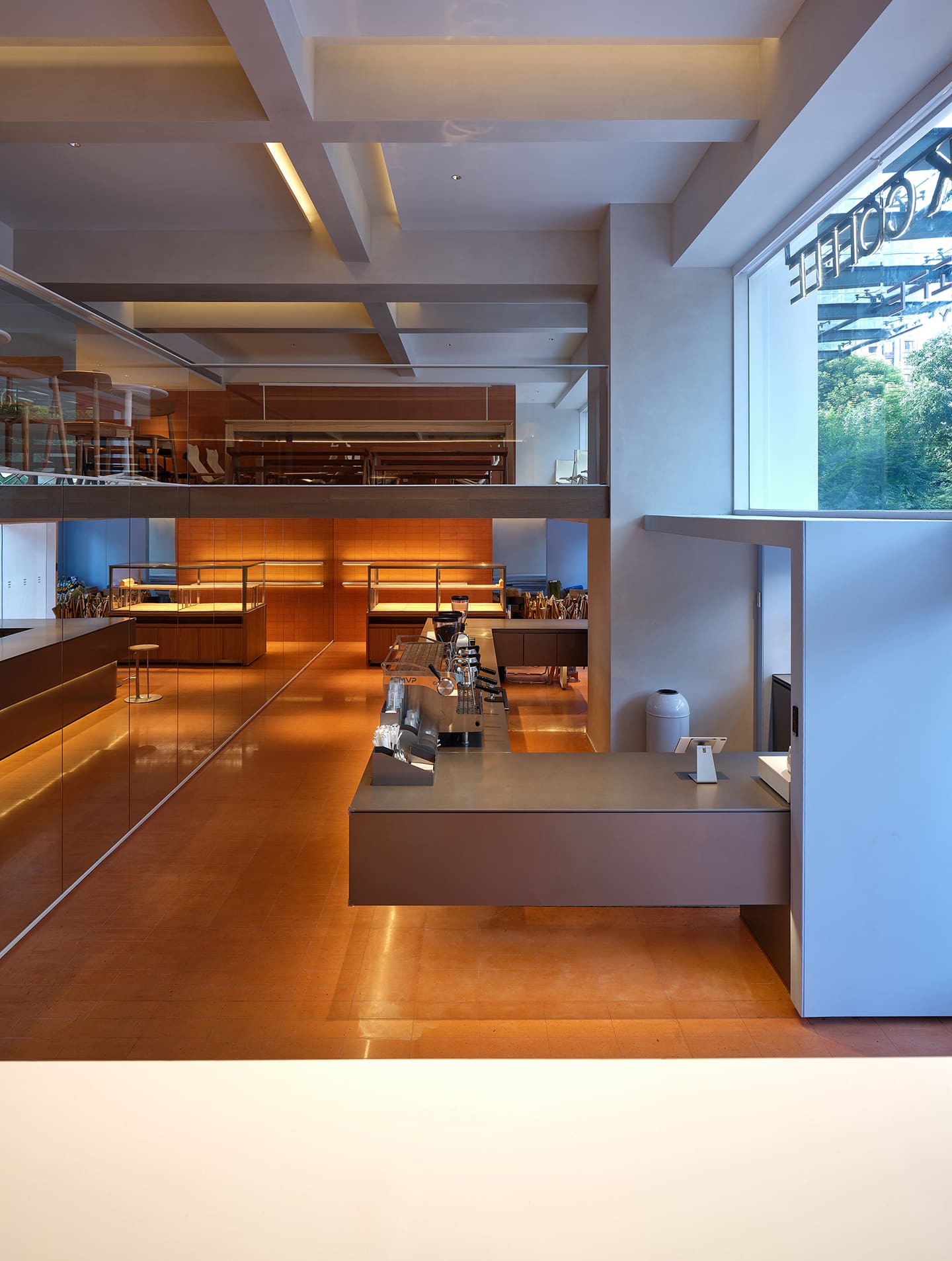
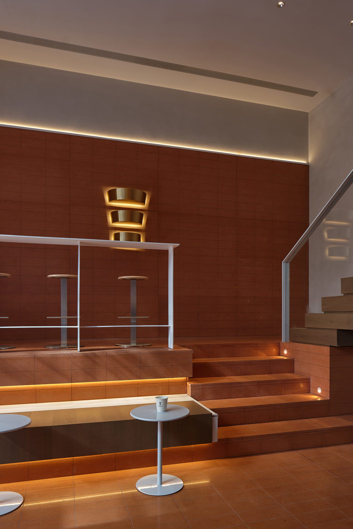
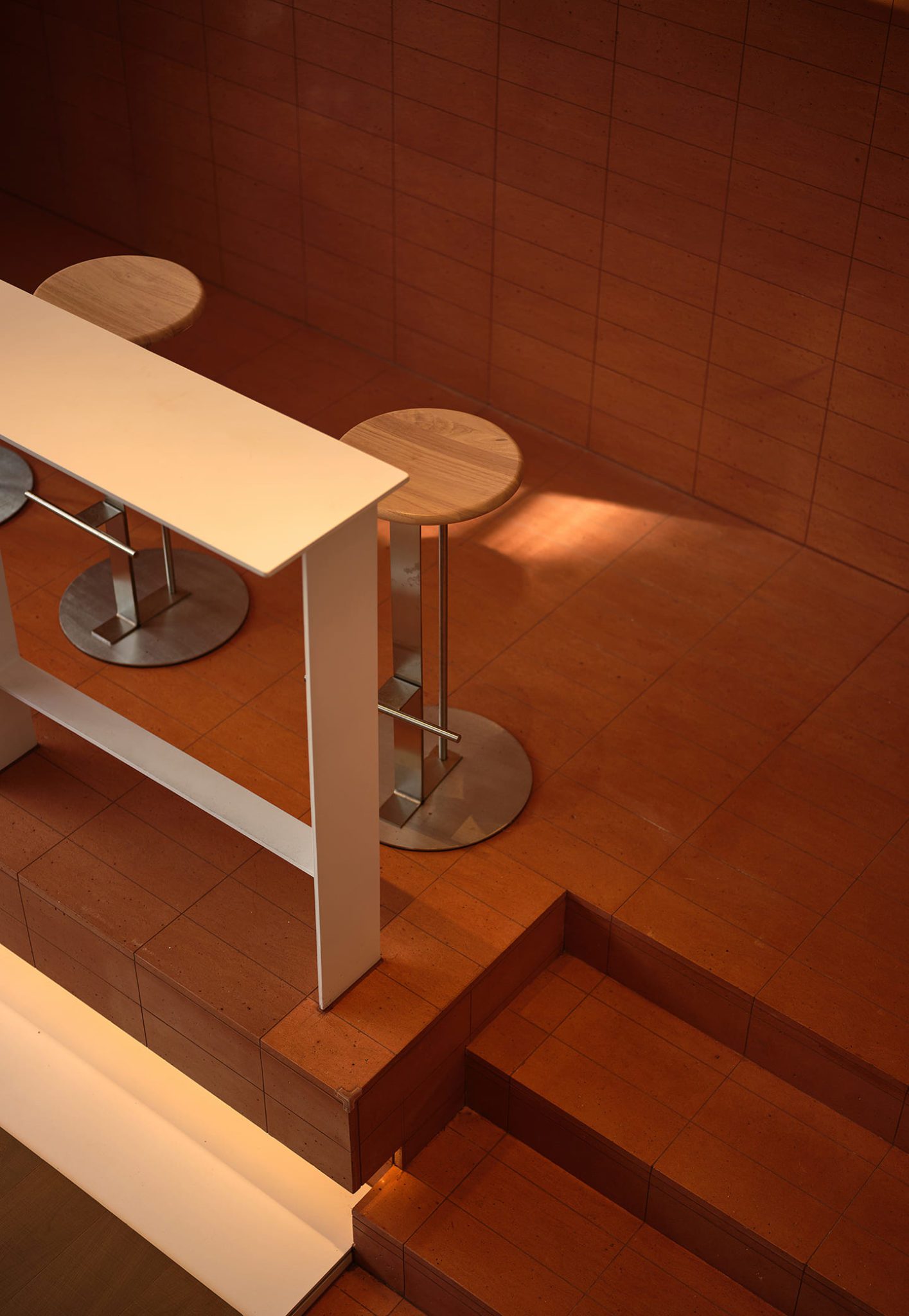
The extension and integration of space are reflected in the materials
As for the selection of materials, the architect tries to minimize the design language to maximize the visual effect from the interior to the exterior.
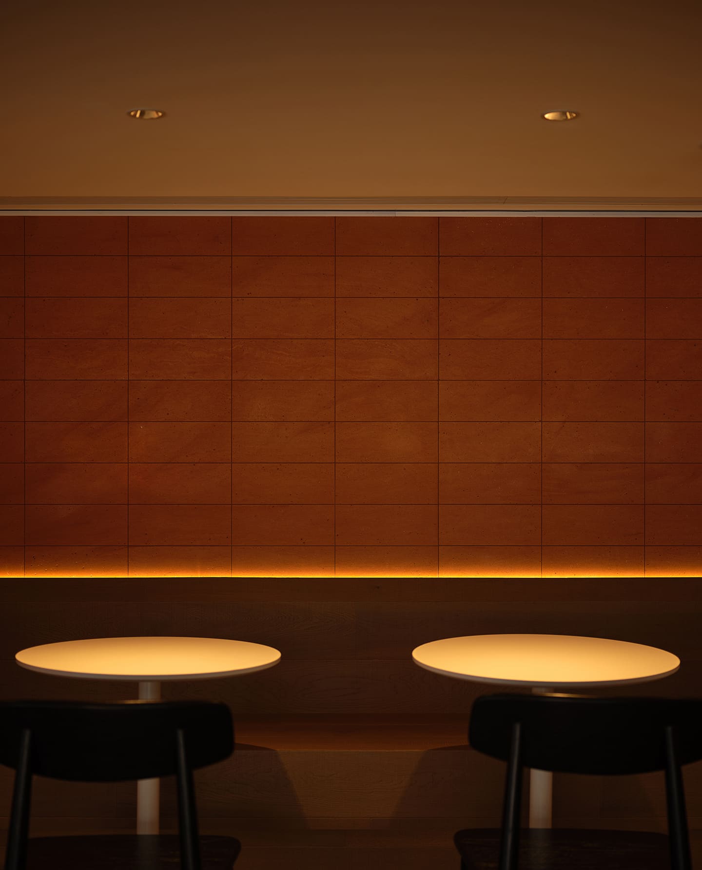
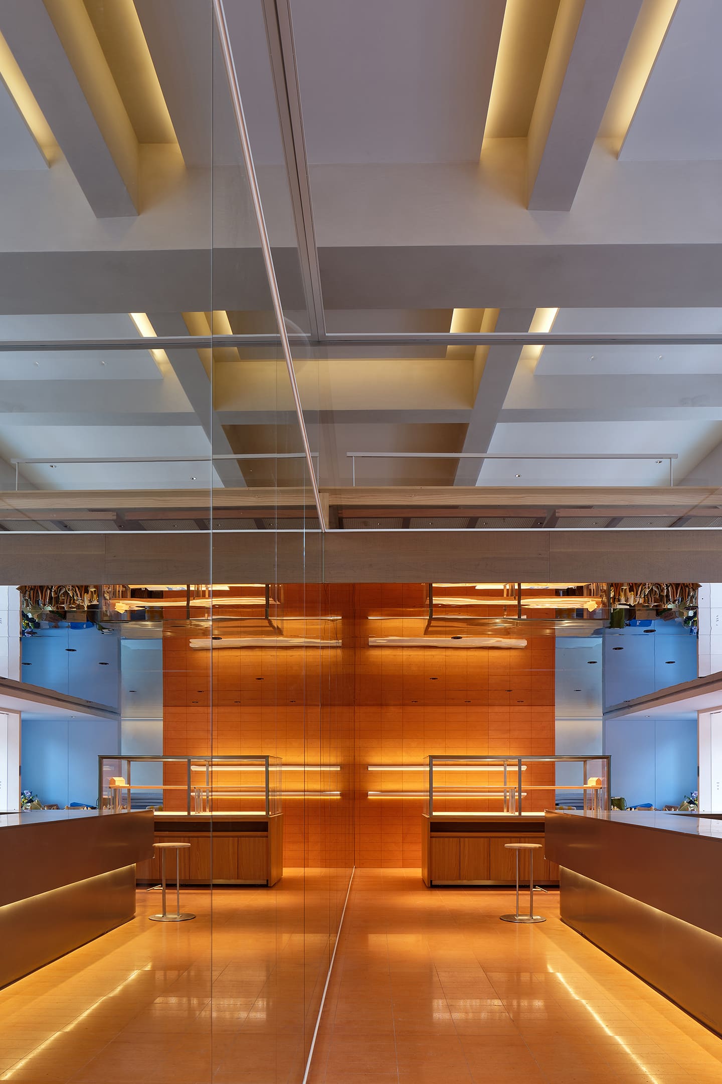
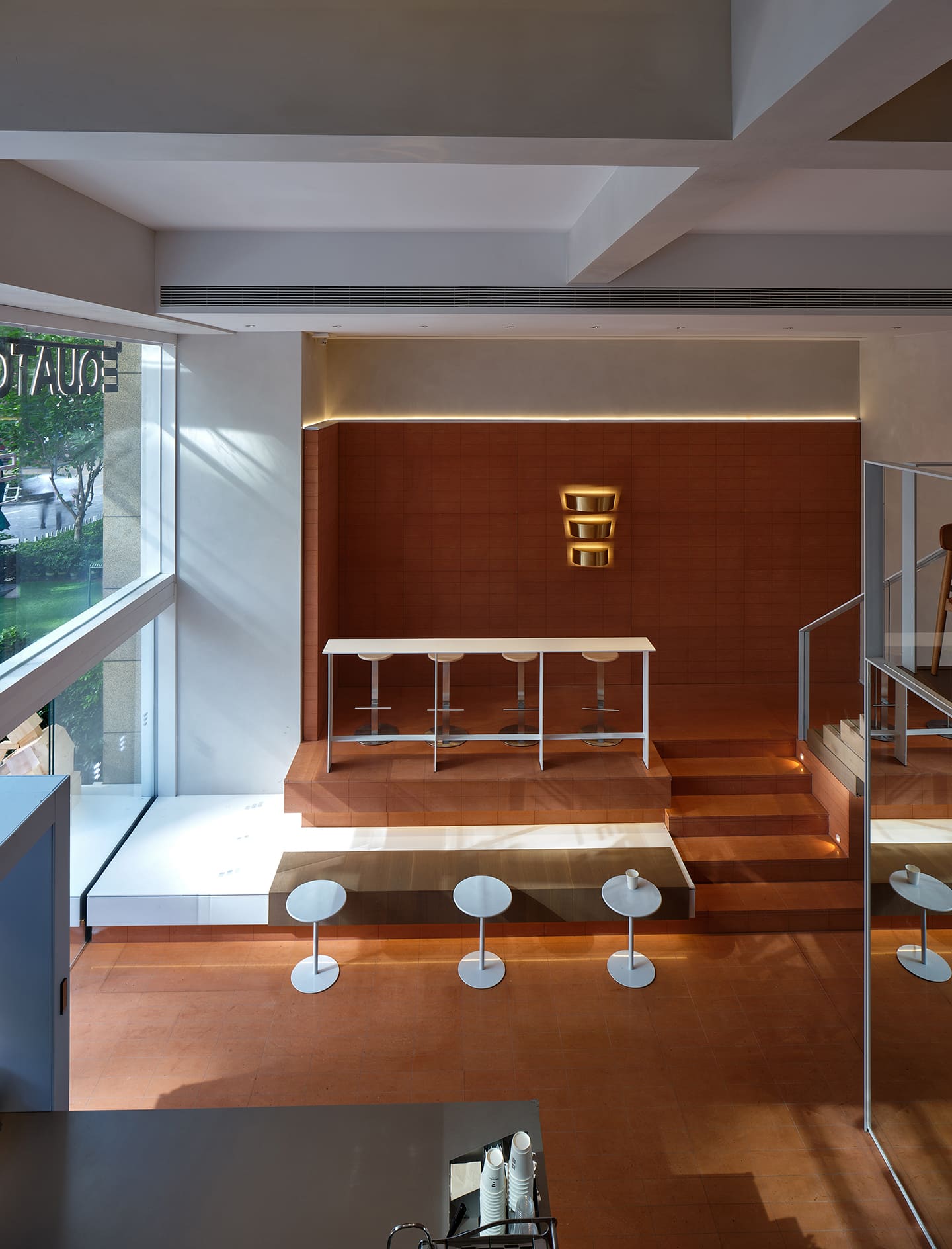
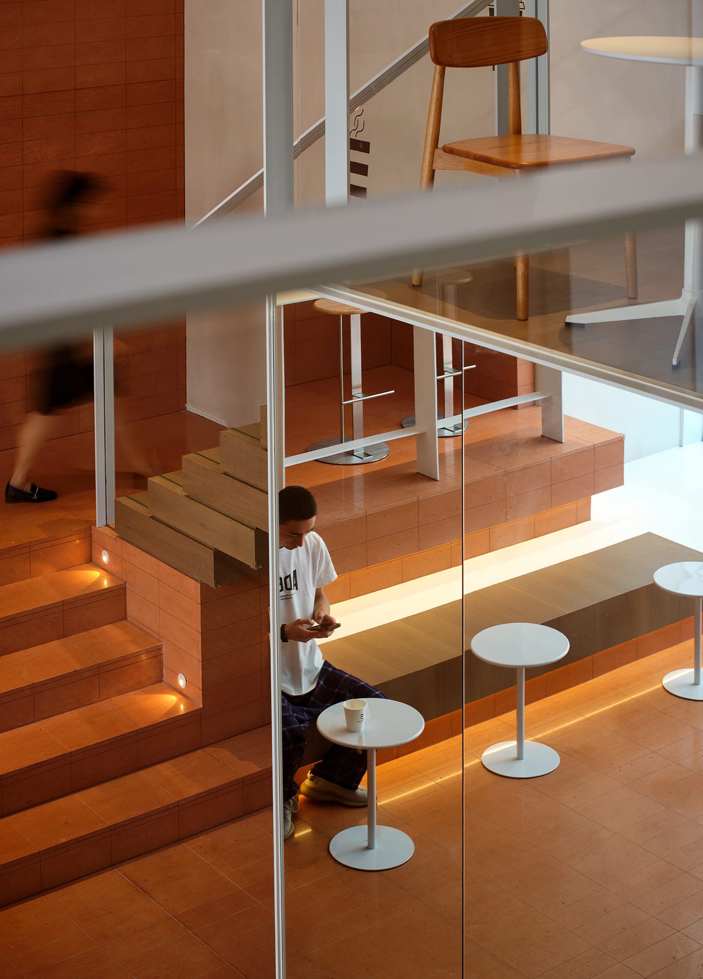
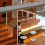
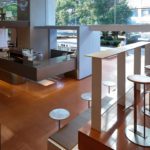
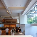
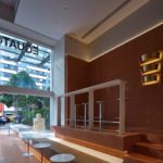
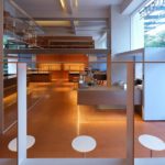
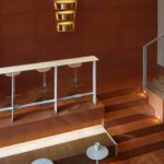
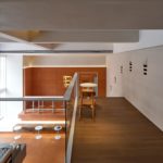
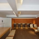
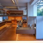
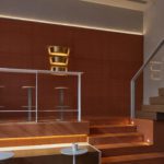
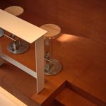
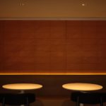
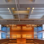
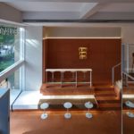
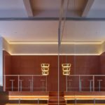
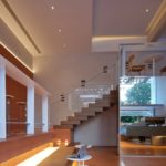
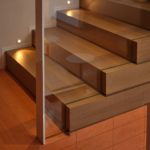
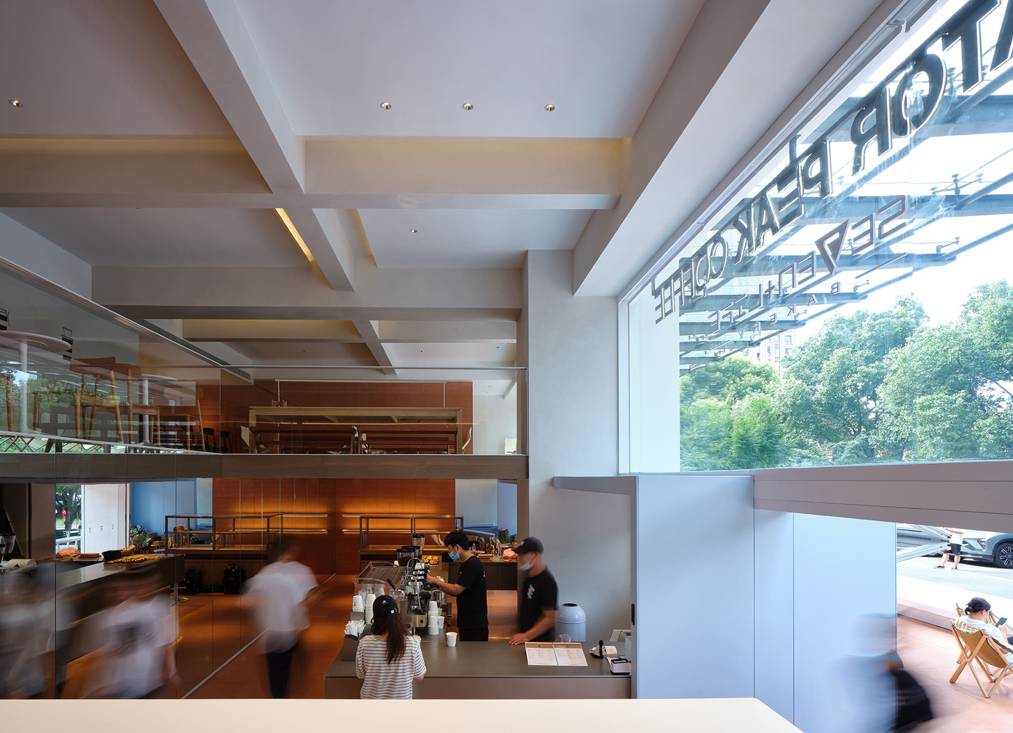
The overall design is dominated by red and white. The flooring and most interior walls are made of red brick, wood, and stone, allowing the space to form a material sensory unity that extends from the inside to the outside.
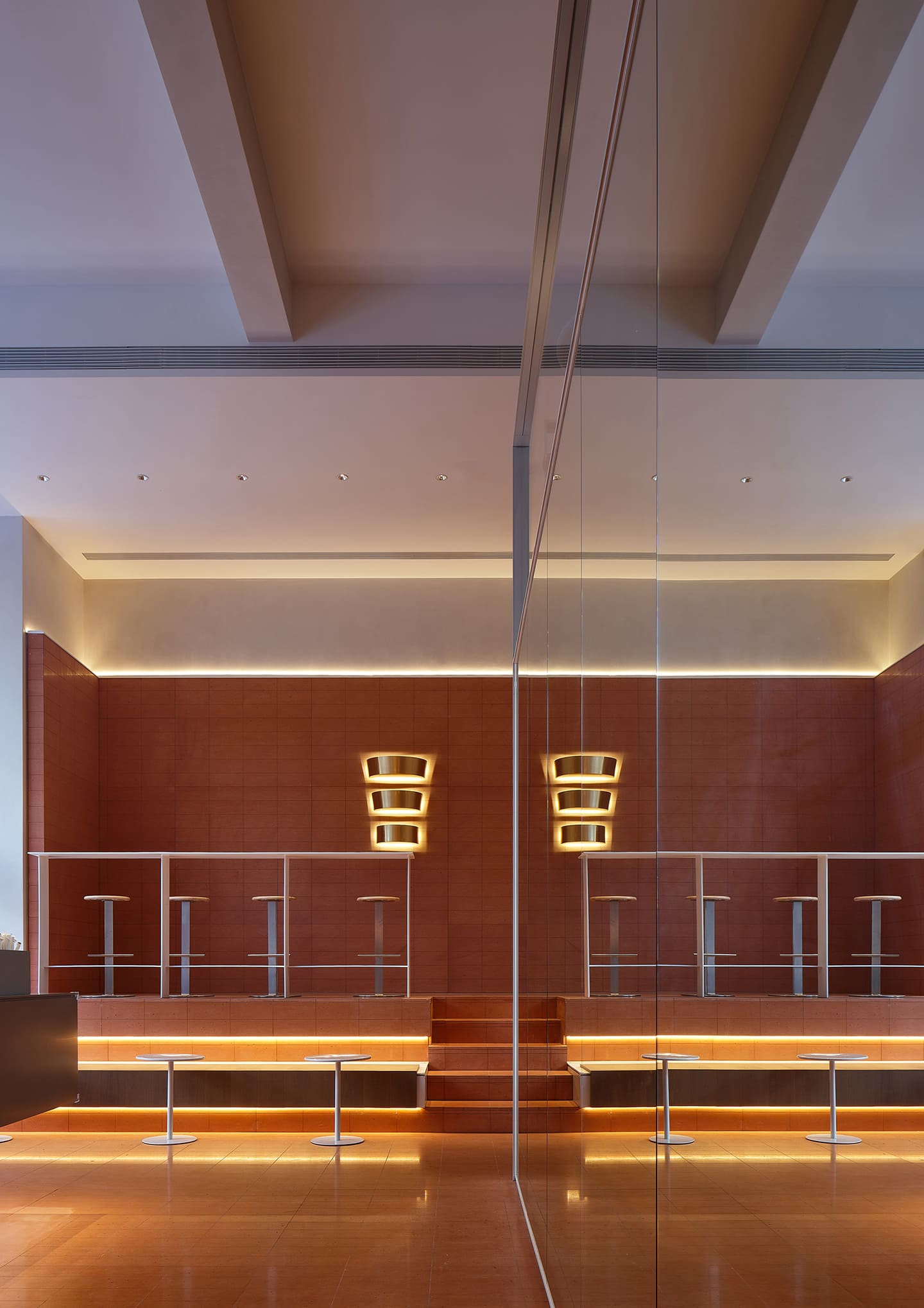
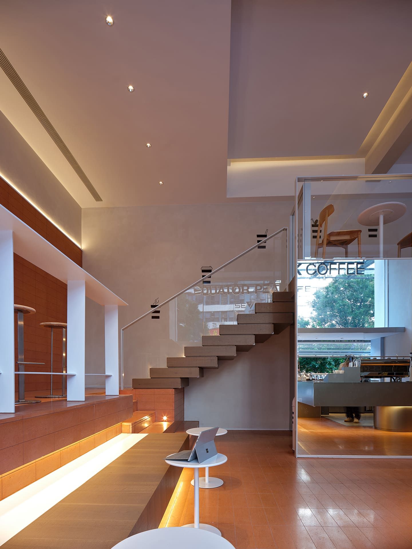
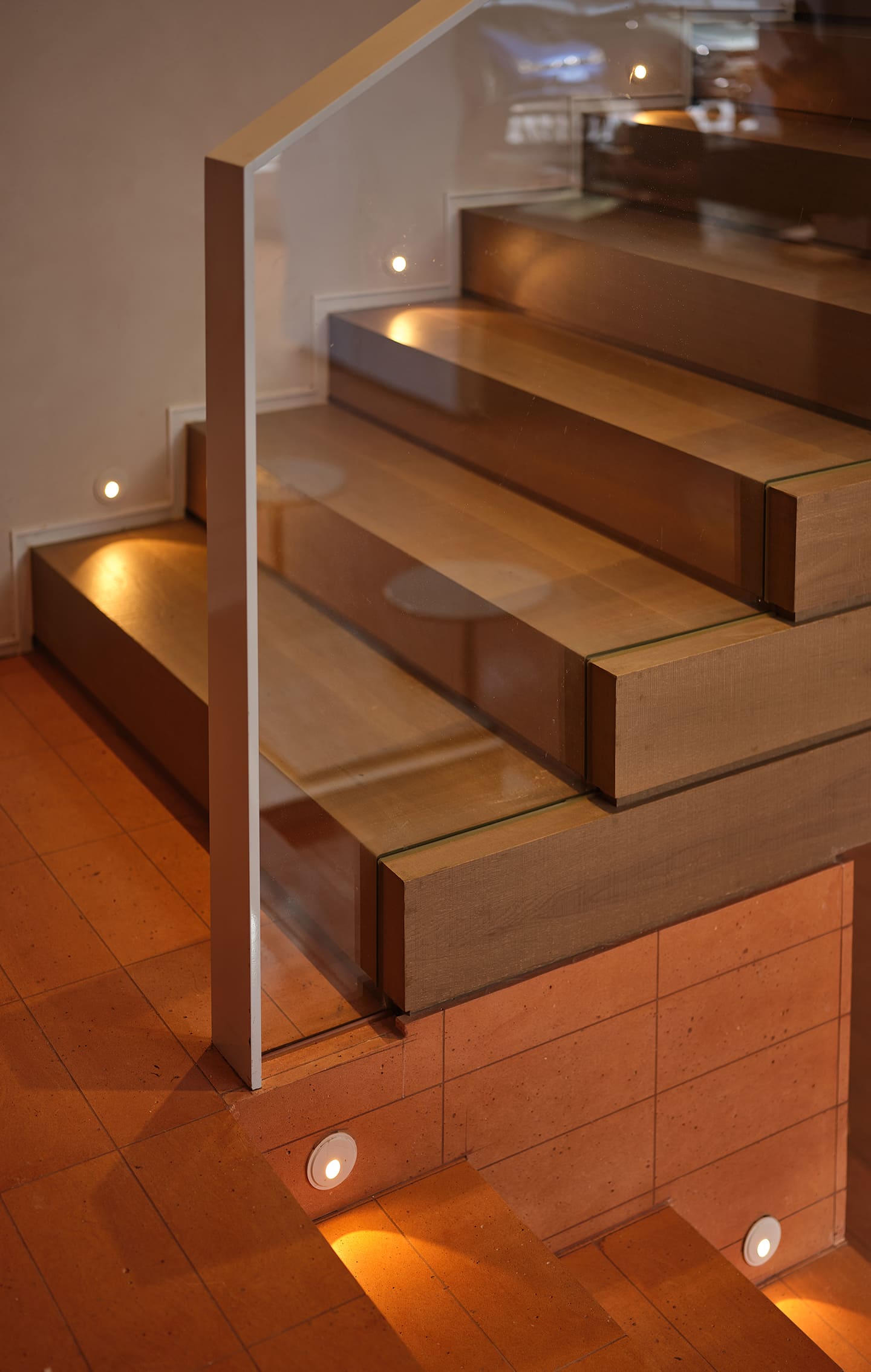
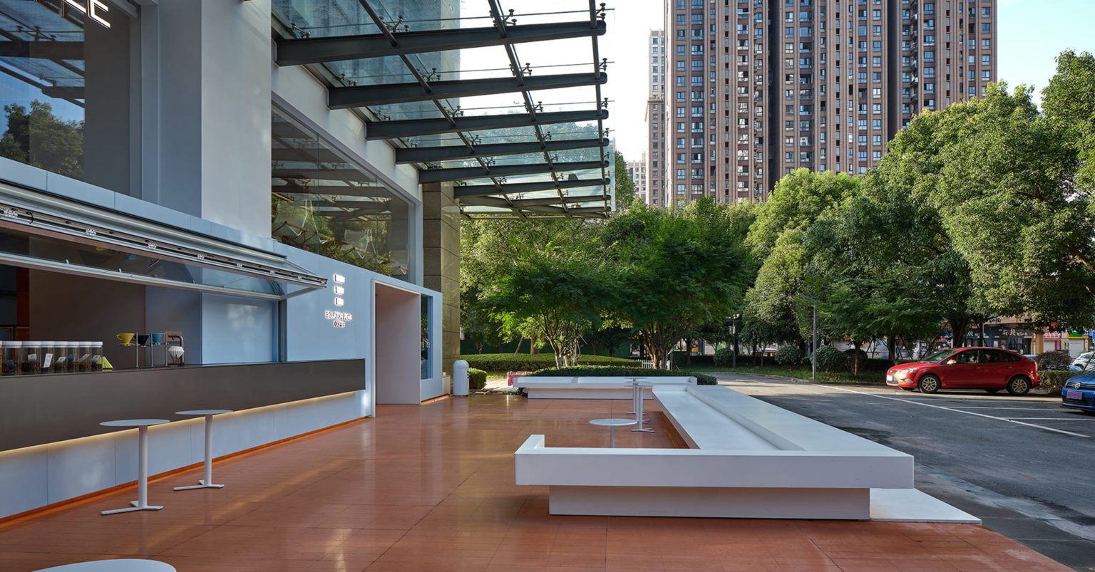
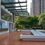
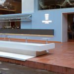
The façade, on the other hand, is more of a white interface. The warm red and wood colors give a sense of envelopment. At the same time, the large areas of white provide a sense of spaciousness. These two colors illustrate the different spatial experiences intended for the interior and exterior.
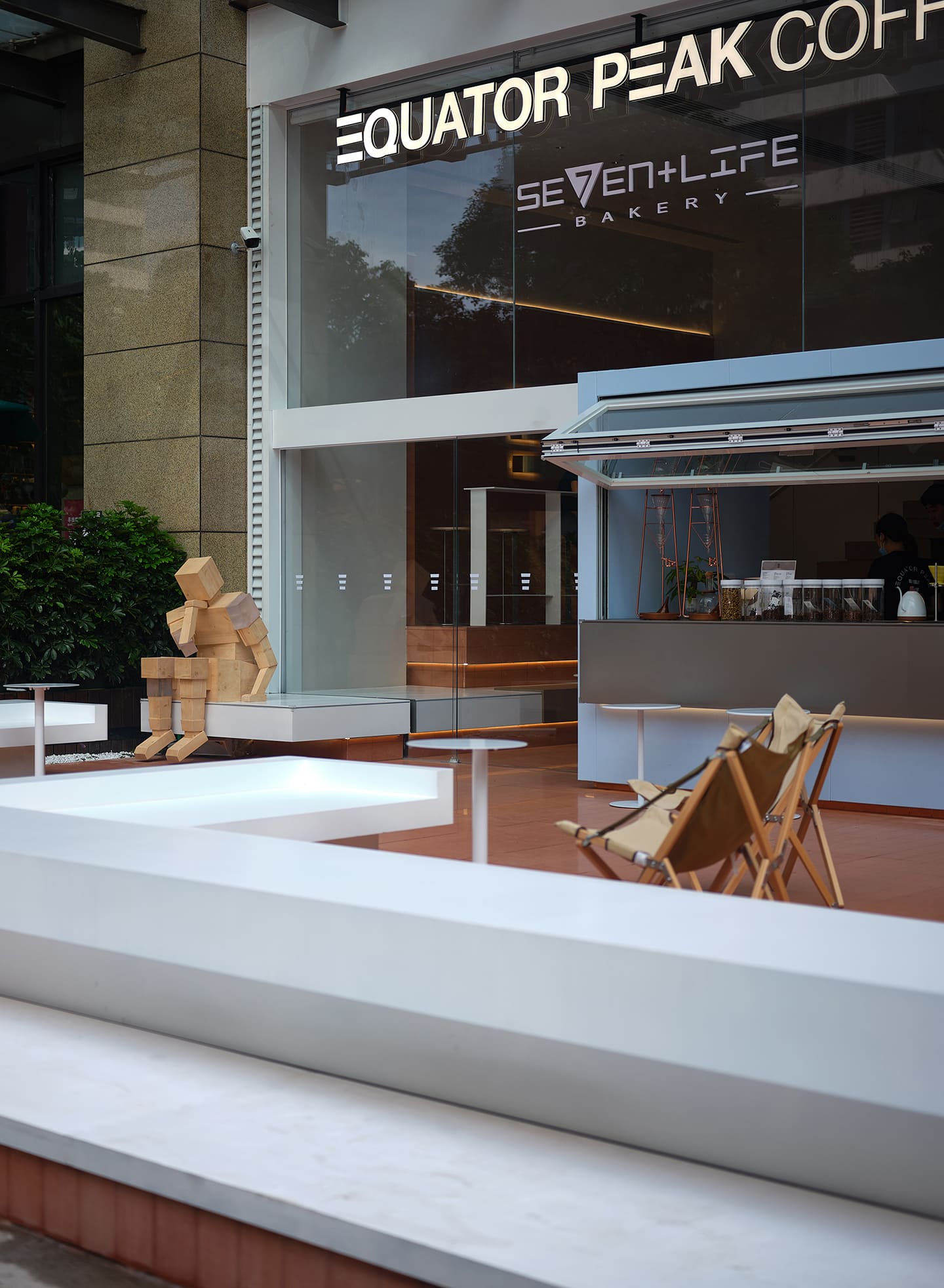
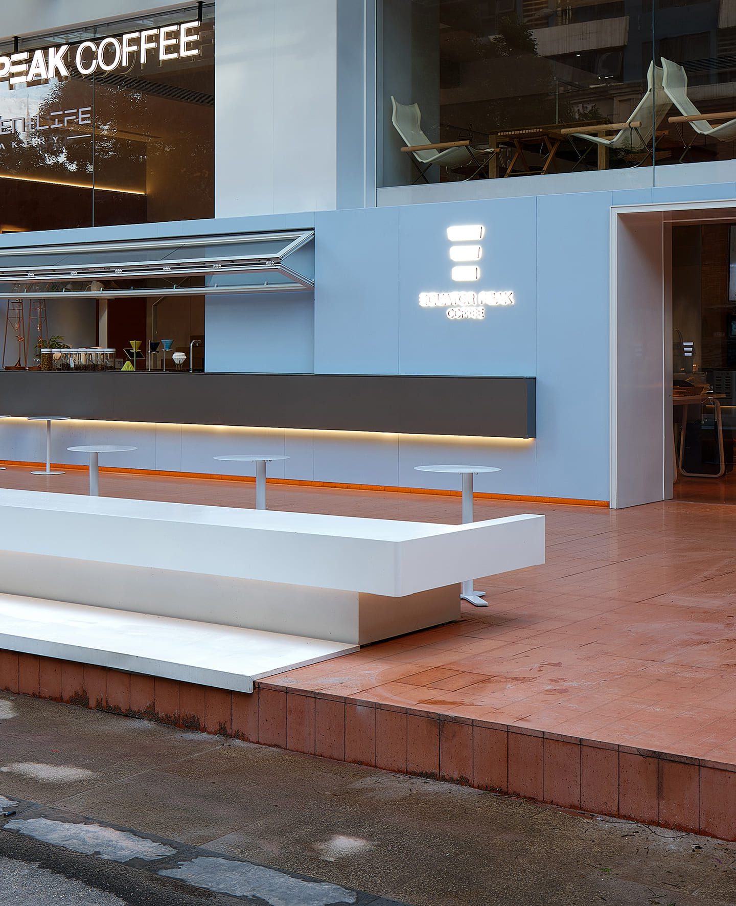
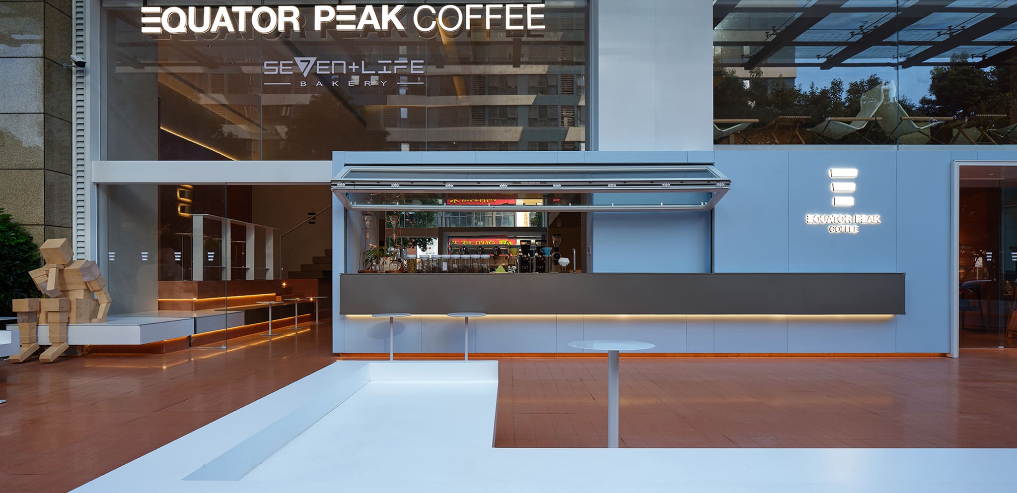
It is worth noting that mirrors are also used in the interior, with the built-in mirrors mapping the outdoor scenes, creating a ‘juxtaposition’ between the interior and the exterior, which undoubtedly strengthens the connection between the interior and exterior spaces and visually blends the two perceptions.
The external gesture of the façade
As a street-level commercial development, especially one facing a busy urban artery, the treatment of the façade reflects some extent, the external attitude of the design.
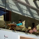
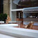
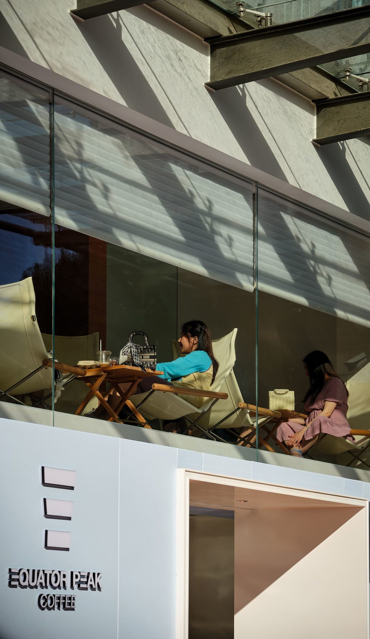
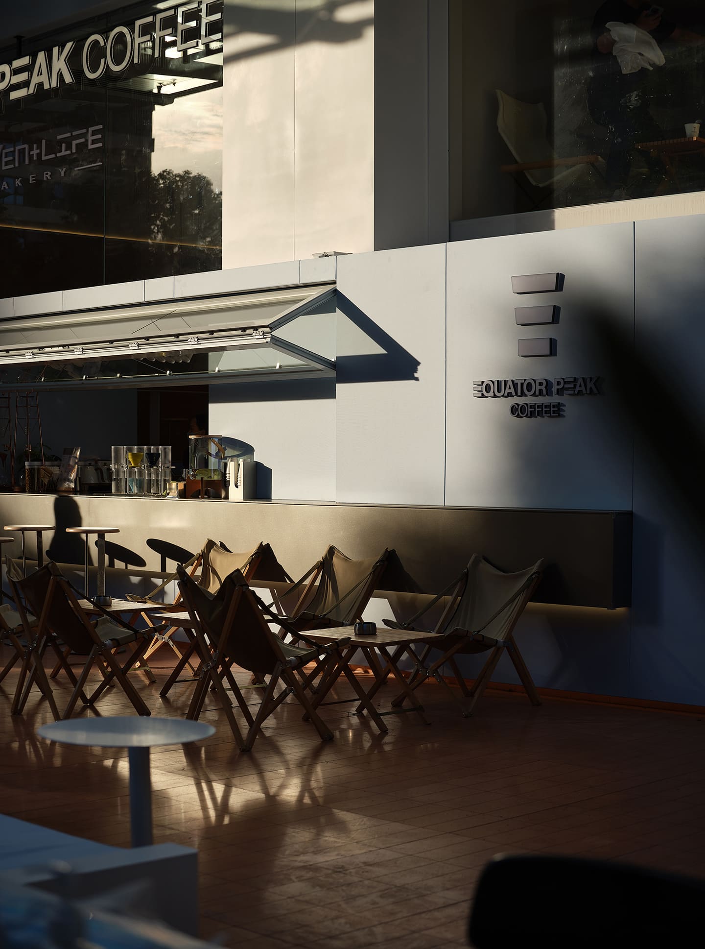
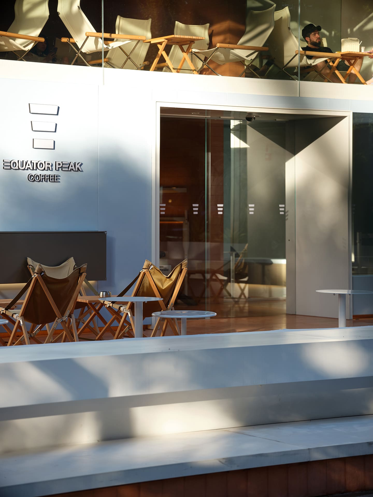
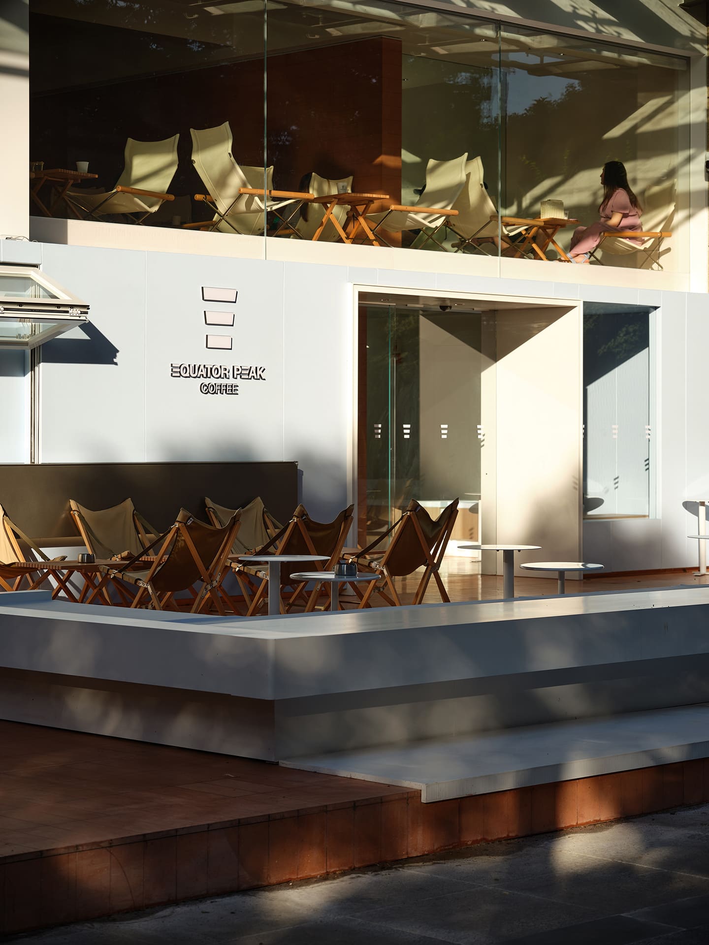
The façade is divided vertically in a 1:1 ratio, with the ground floor façade being clean and simple, with the first floor sharpening its permeability through large areas of floor-to-ceiling glass, thus creating a contrast between material and reality while mapping the surroundings onto the glass. The design demonstrates an inclusive gesture independent of its surroundings and the building but simultaneously tries to embrace and integrate it.
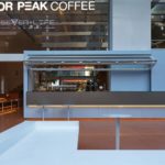
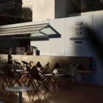
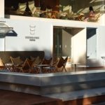
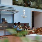
The upward folding windows create an outwardly communicative street vending experience, which, combined with the open outdoor dining terrace, subtly creates a resort-like atmosphere.
Design for a ‘camping’ experience
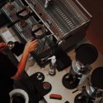
From the interior to the exterior, from the space to the façade, the architects have actively expanded their approach to coffee operations and sales, returning the focus from the spatial and commercial past to the original consumer experience.
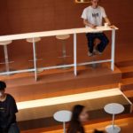
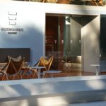
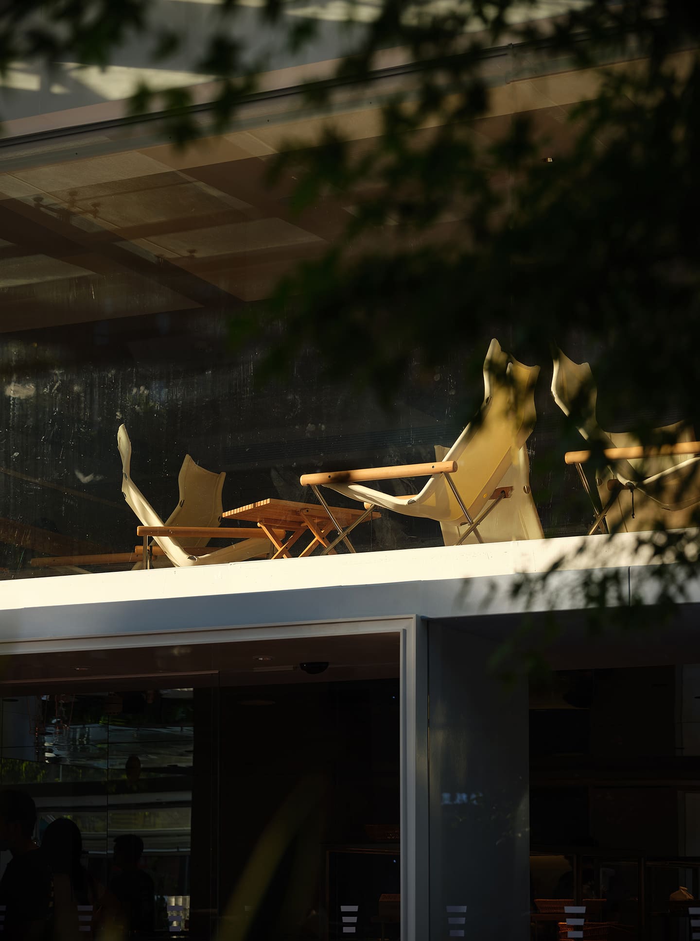
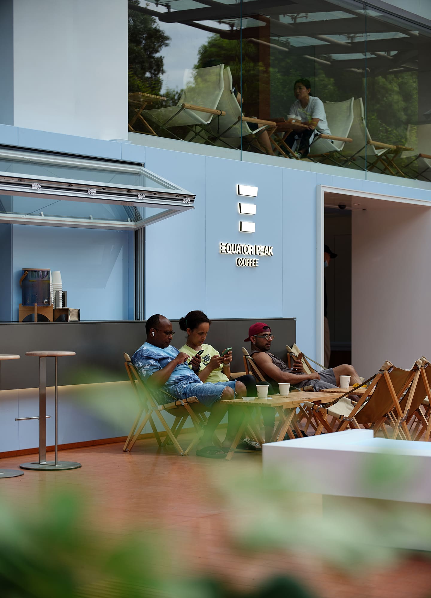
They have attempted to visualize “a book and a cup of coffee in the sun” in the design of the space, trying to create a “camping” atmosphere. In their view, coffee should be like camping, where people who know or don’t know each other can communicate and have conversations, a new mode of interaction.
Suppose social media is seen as a medium for socializing freely online. Can the inclusive and open café-like business also be a medium for mixing offline? It seems that “strangers and acquaintances alike can come here to socialize” is an ideal and beautiful hope. With the EQUATOR PEAK COFFEE project in practice, this new mode of operation and social relationship may not be far away.
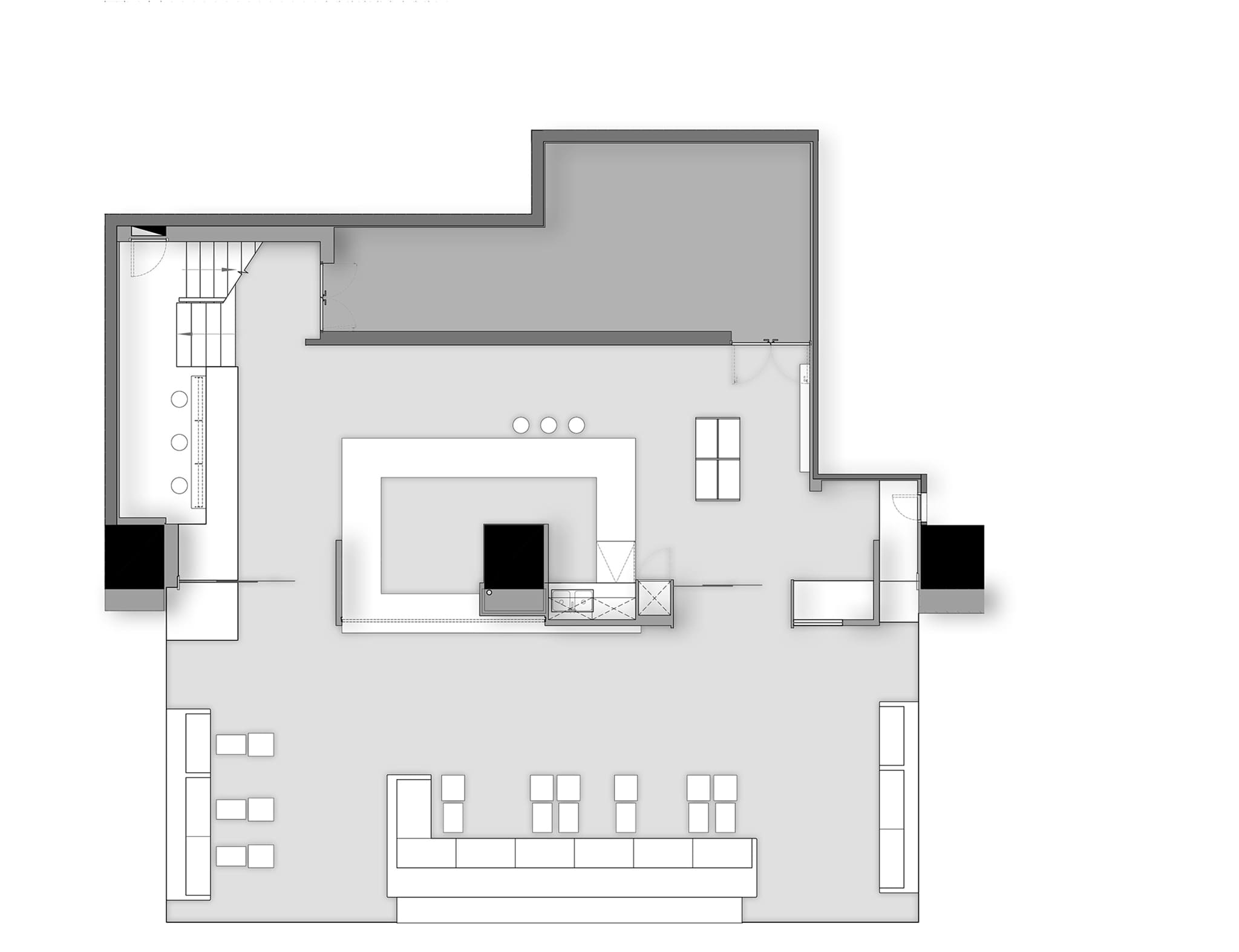

The project description is provided by the designers.
