Project Credits & Specs
- Design Company: ARCHIHOPE Ltd.
- Photographs: Vincent Wu
- Location: Qianhai, Shenzhen City, China
- Area: 8 155 m2
- Year: 2022

Project Description
Responding to the Spirit and Body in Urban Texture
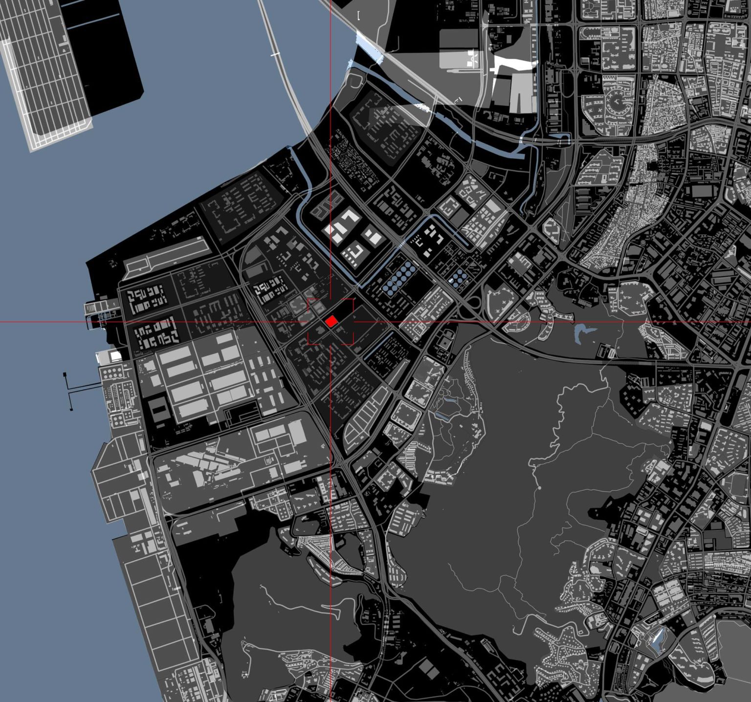
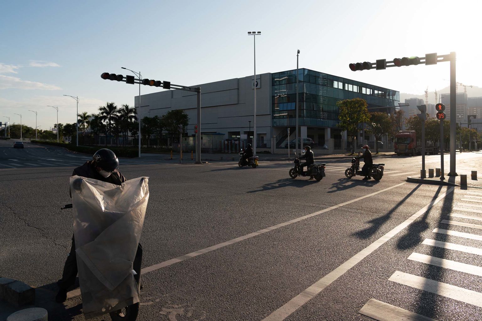
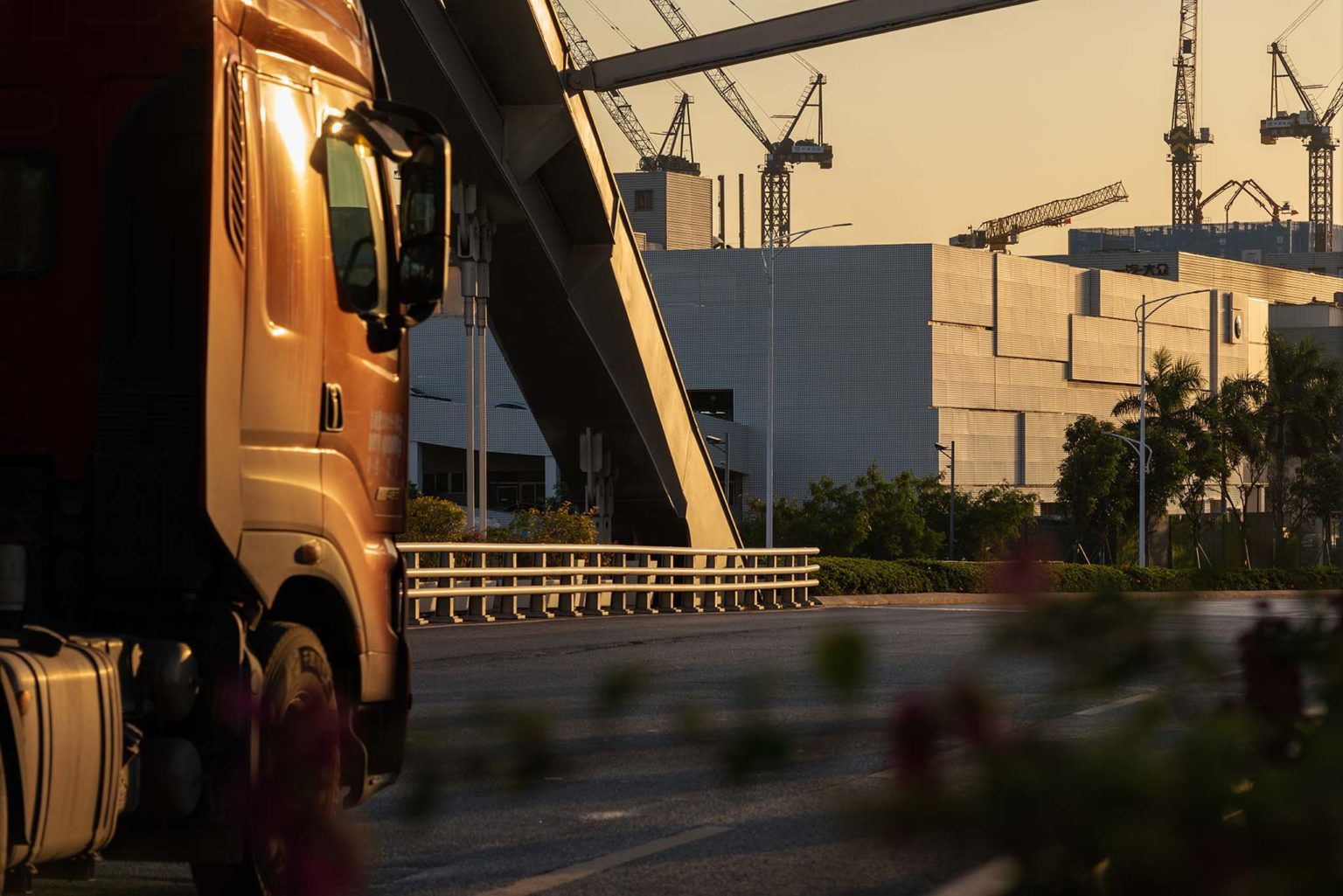
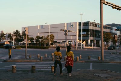
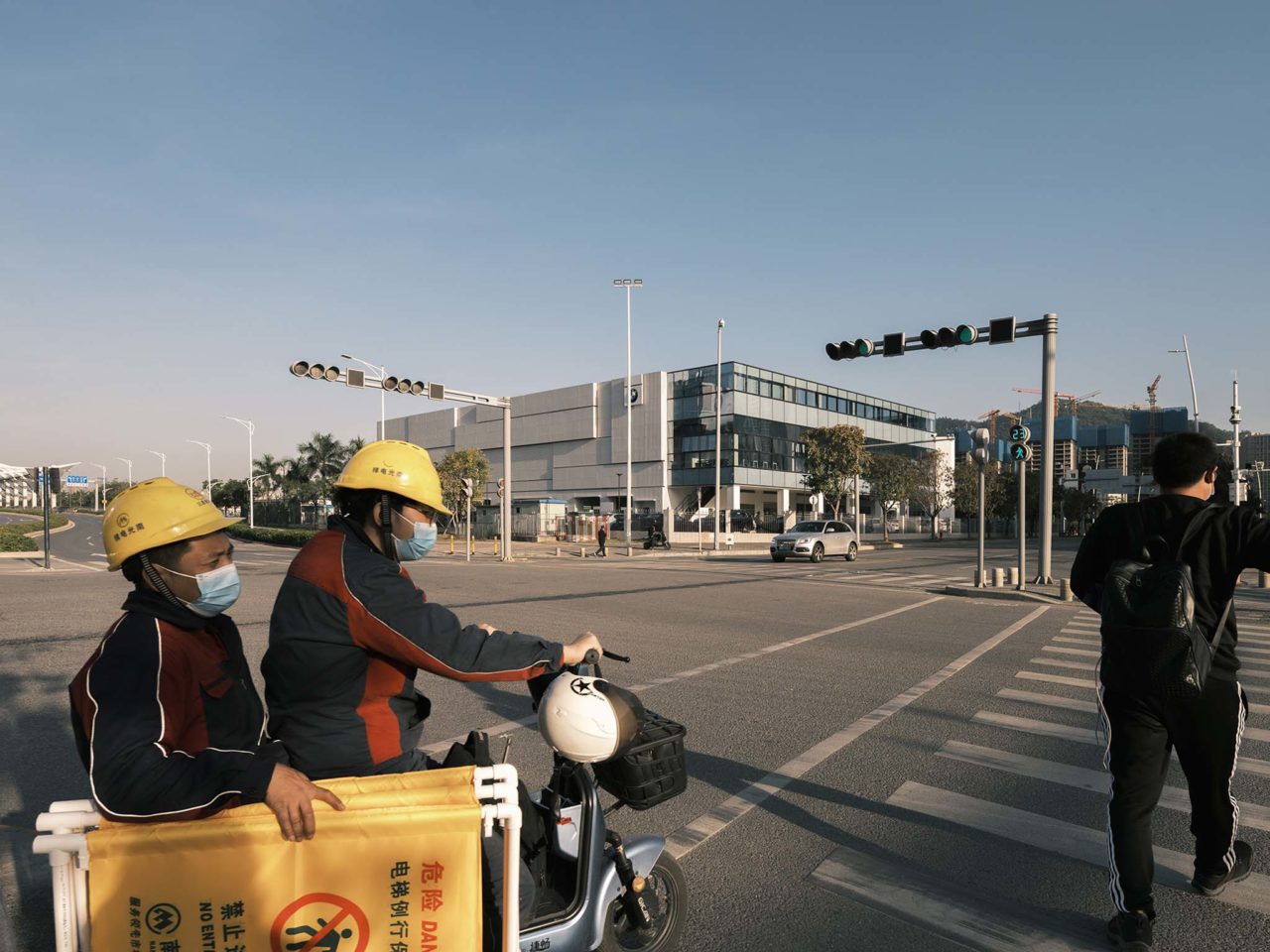
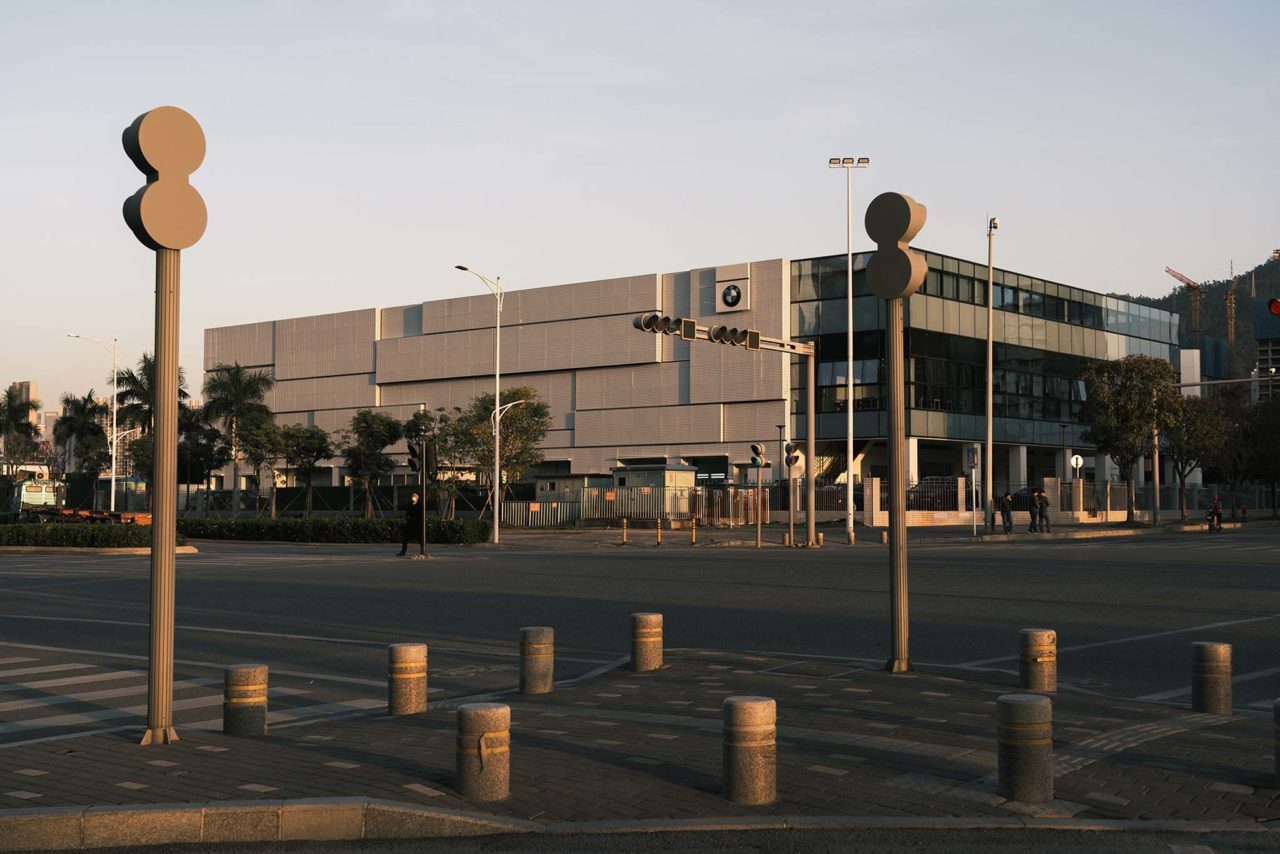
As the forefront of the New Special Economic Zone, Qianhai continues the innovative characteristics of Shenzhen for more than 20 years of reform and opening up, carries the unique Marine culture as the core internal driving power, and demonstrates the innovative and inclusive urban spirit. The customer experience center for BMW is located at the junction of Zhenhai Road and Gangcheng Road in Qianhai Cooperation Zone, Shenzhen. Taking into account both the hot and humid environment and conforming to the spirit of the city, the designers reinterpreted the existing building based on the design principle of sustainable development.


The relationship between buildings and urban texture is a synthesis of objective existence and subjective judgment. Integrating into the urban texture is not only for the agreement on the style of the façade but also for the integration of internal spirit, the synchronization of lifestyle, and the corresponding to future development. The project is a transformation from an existing old workshop building, and the designers focused on the problems such as architectural facade, noise, shading, ventilation, and daylighting and then rejuvenated the inherent vitality of the overall project.
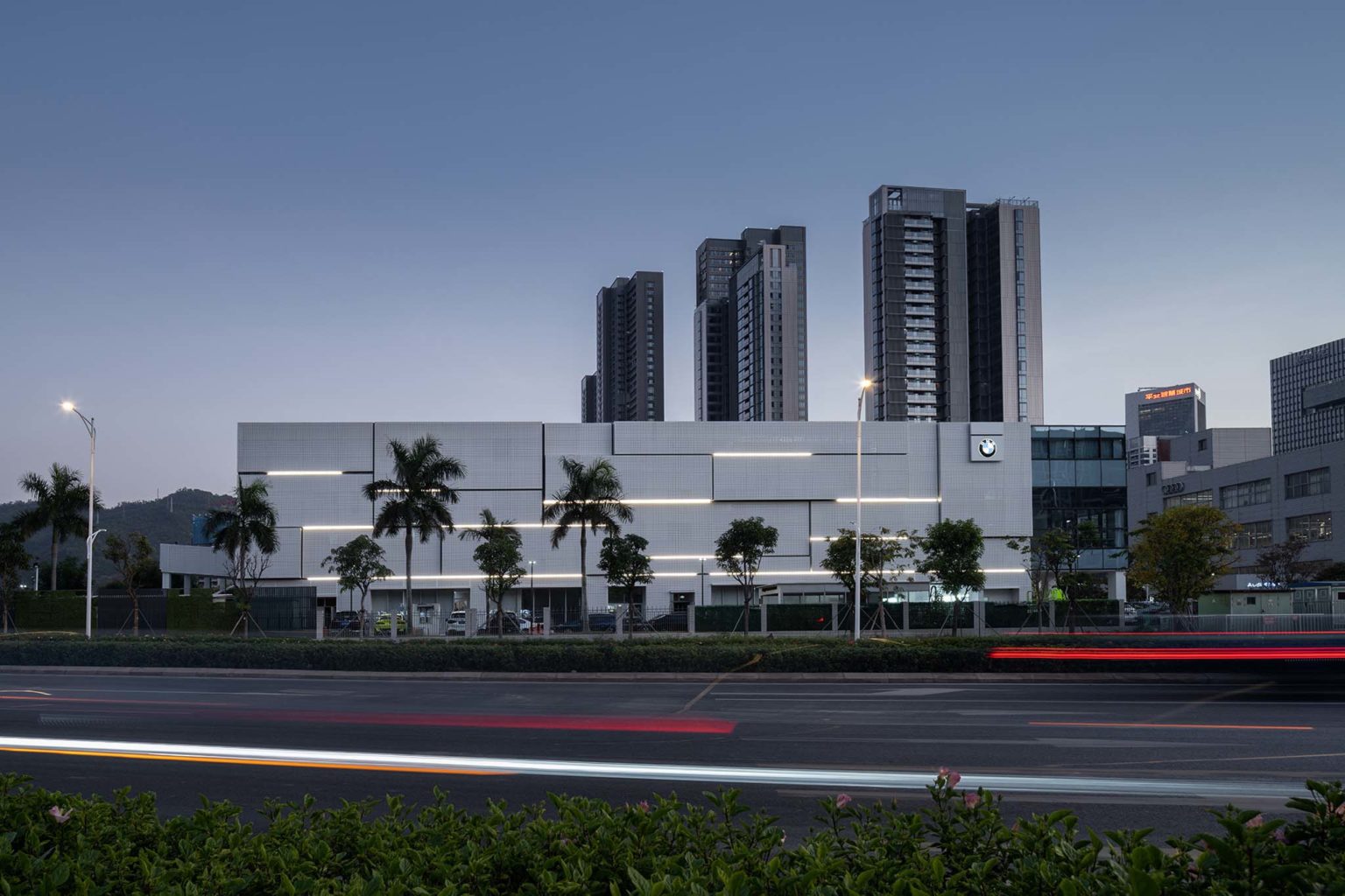
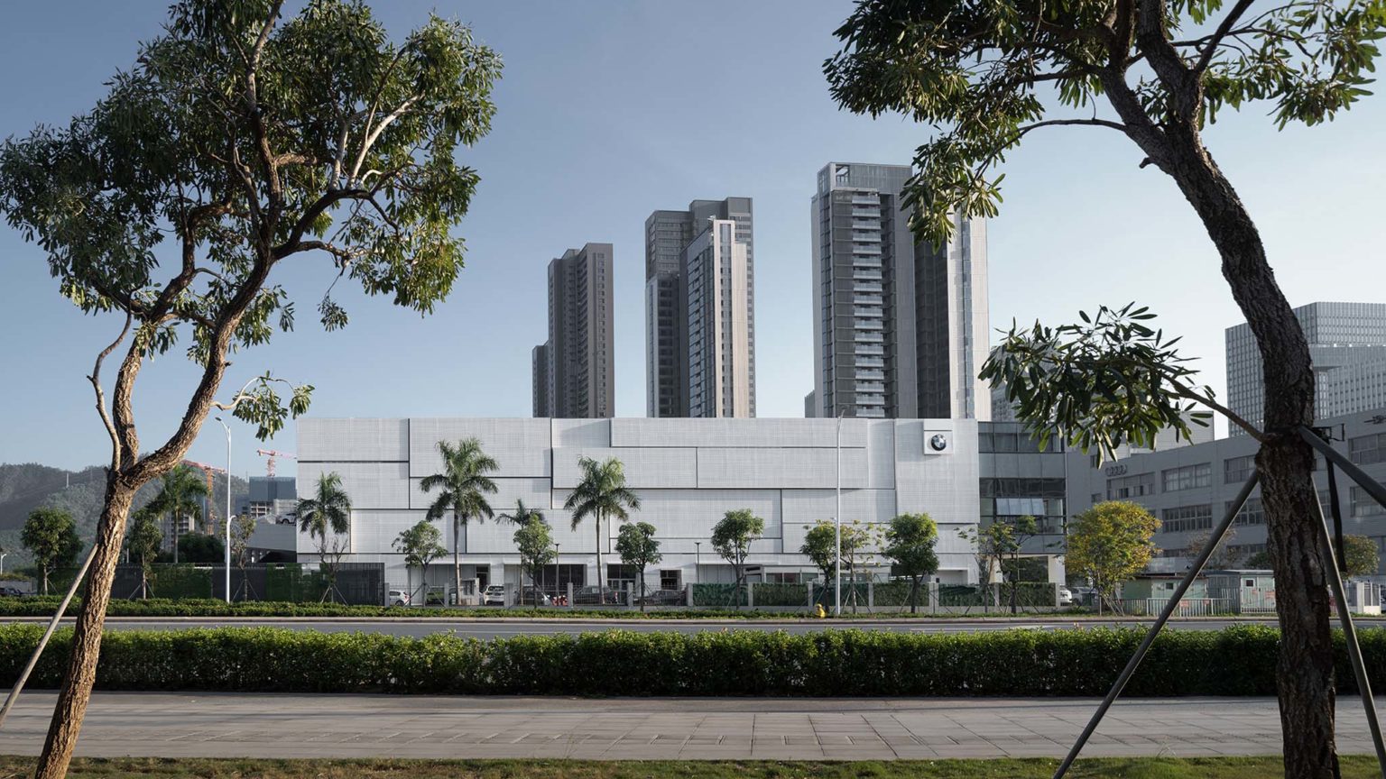
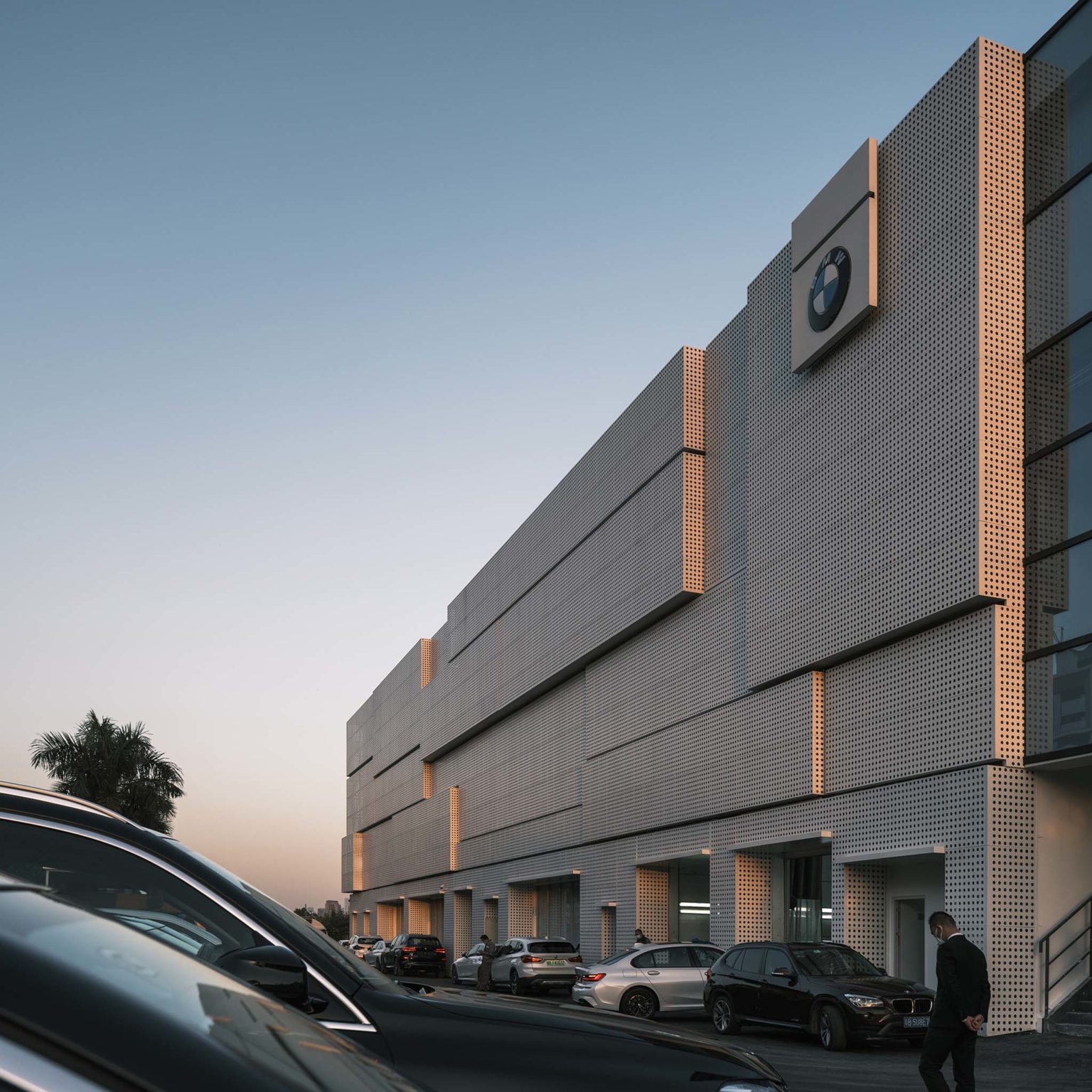
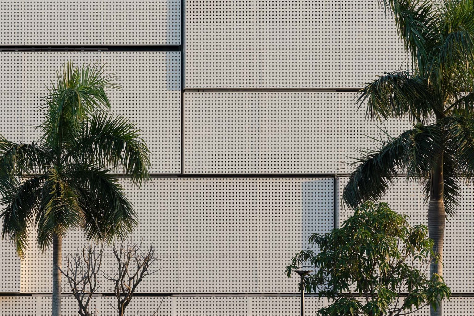
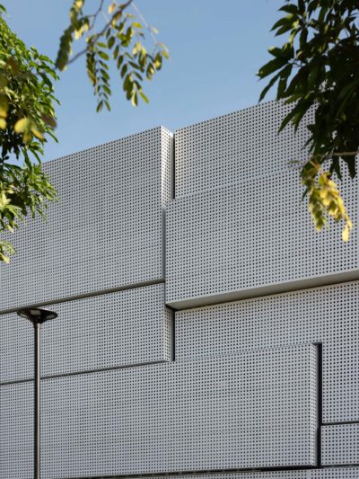
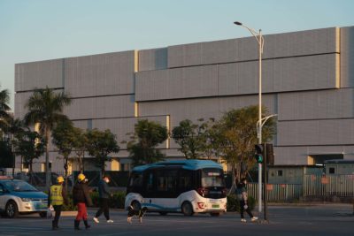
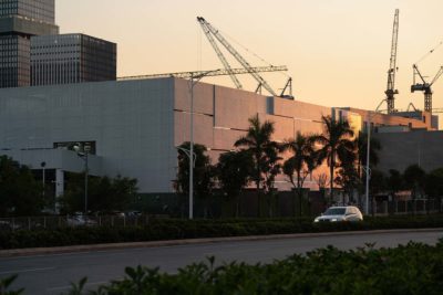
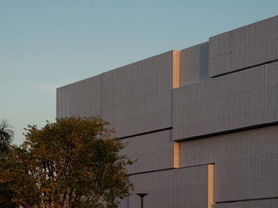
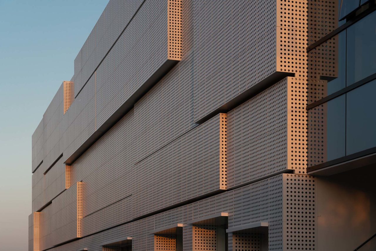
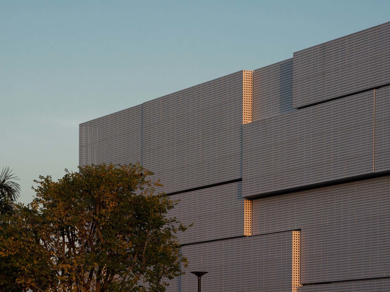
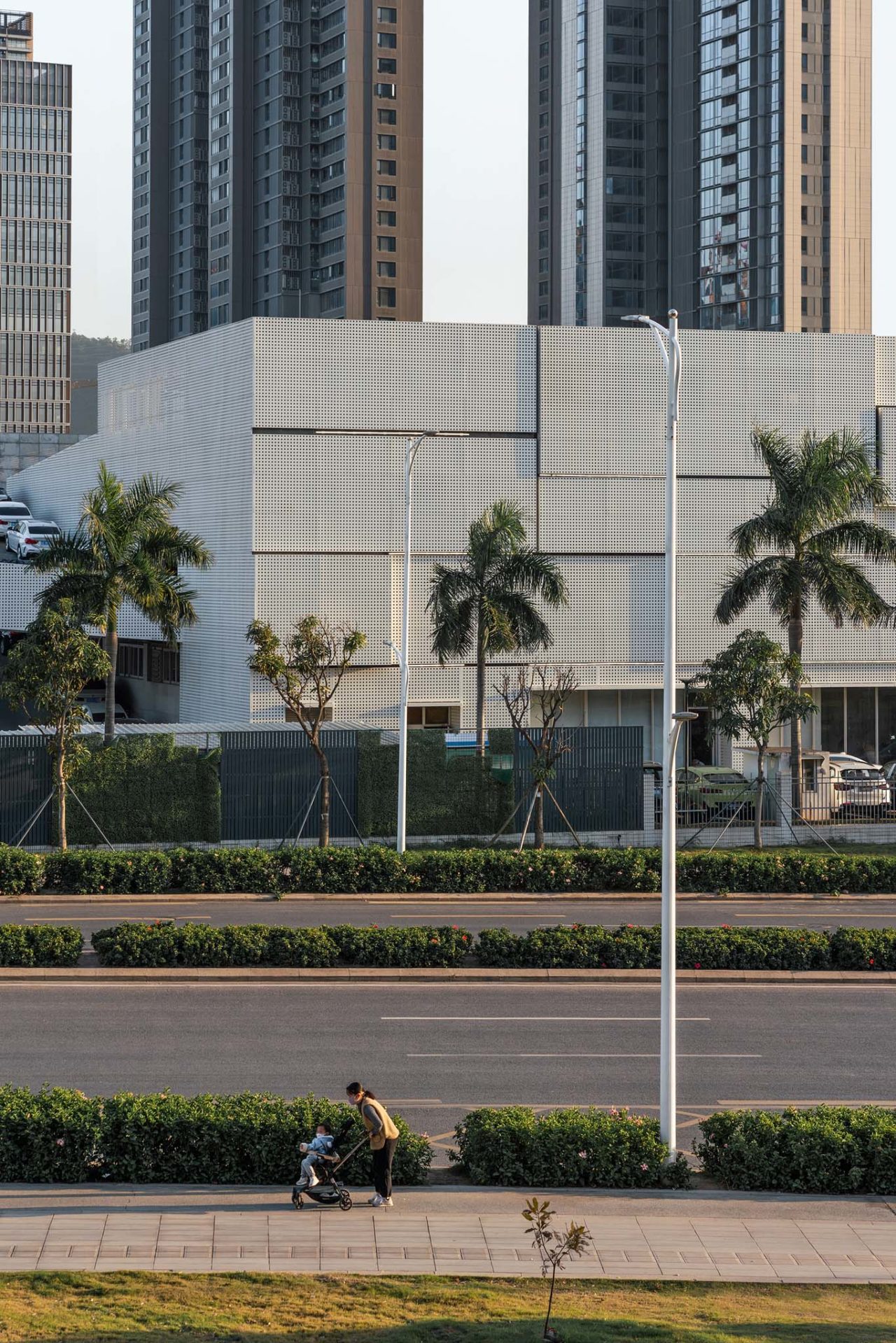
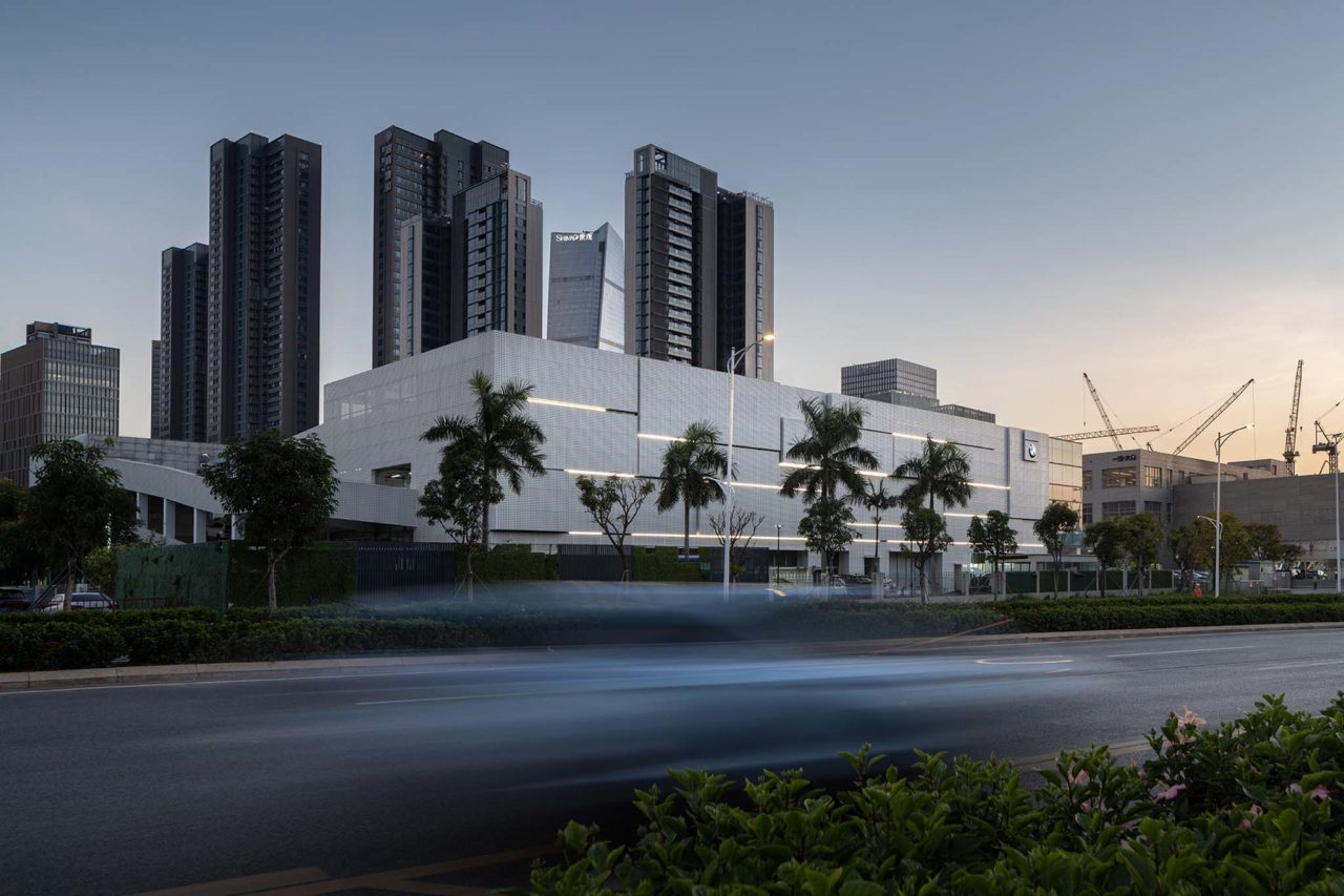
Focusing on facade design and according to the characteristics of Qianhai as the forefront of the New Special Economic Zone of Shenzhen, in terms of the façade, the designers abandoned those design forms with special and exaggerated shapes and used simple and succinct stacked cube boxes, which made the architecture look like containers arranged in geometric pattern and integrated the features of modern industry into the texture of urban streets.
A building with a sense of life should not only form an exterior interior echo with the urban context but also vary with the dawn or dusk and the four seasons. Shenzhen, as a marine center city, features a distinctly hot and humid climate, so it is necessary to face its climate rules and geographical features so as to integrate life and work into Qianhai.


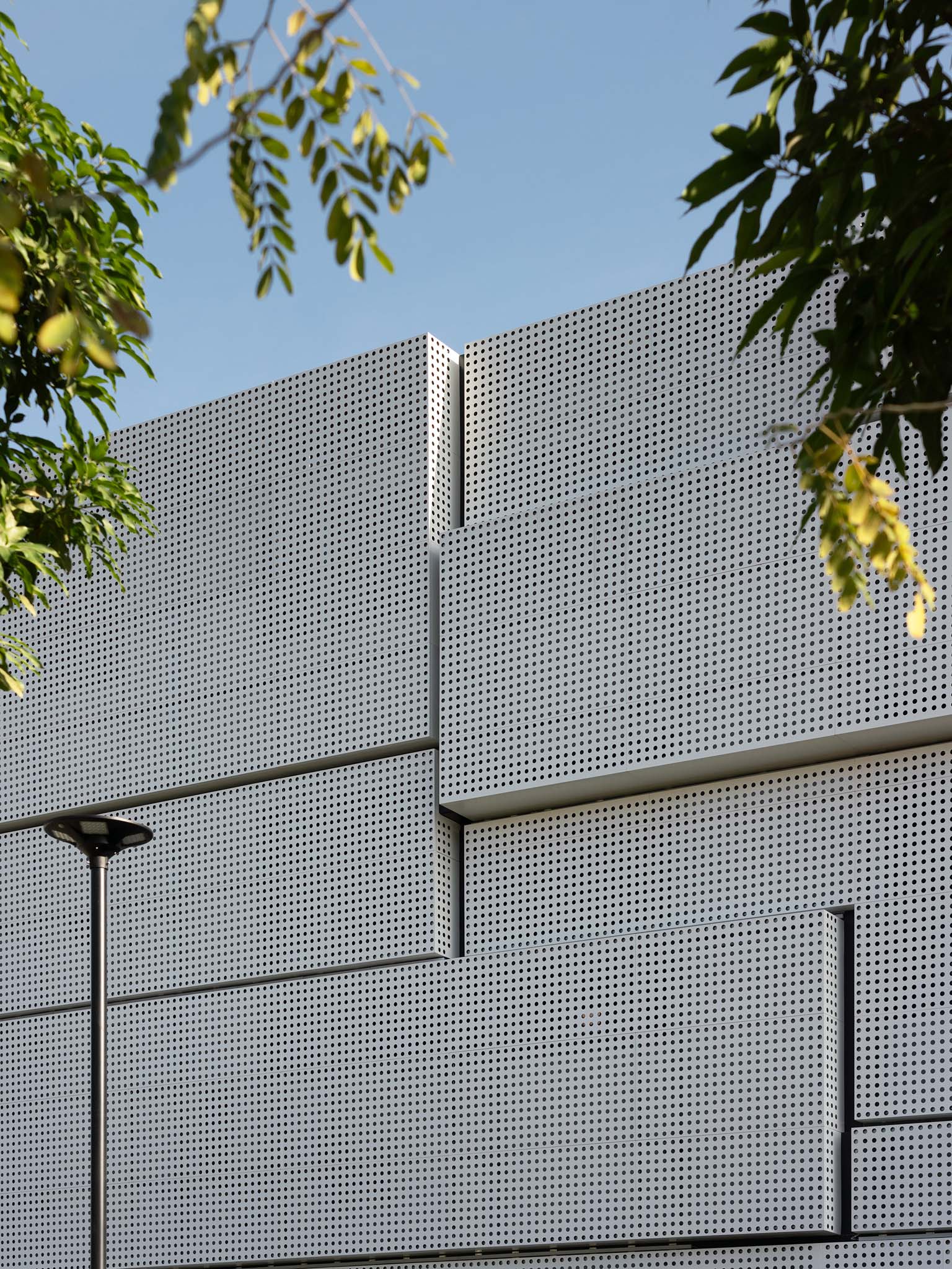
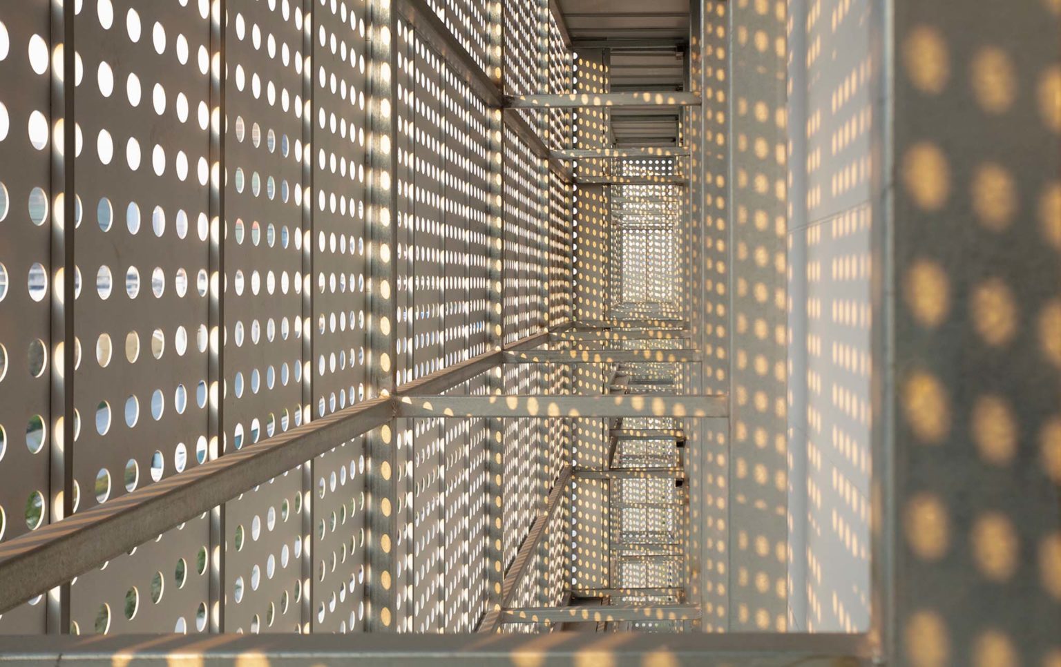
The design team adopted a passive building prevented-heat strategy that used PVDF fluorocarbon coating perforated plate, perforated aluminum plate, and round hole perforated plate on the facade. In addition to forming a “composite skin” with a double-layer curtain wall, the design also makes it possible to filter sunlight into diffuse light to provide natural ventilation and stable temperature for indoor space.


Another advantage of a perforated plate is that it can display rich changes in texture effect and clear layers of blocks surface by properly controlling the proportion of material and texture. Besides ensuring good daylighting, it is also covered with a layer of “veil” on the building facade to create a mysterious and science fiction atmosphere at the same time. Synchronized with the weather conditions from morning to evening of the city, the overall building directly reflects the movement and transformation of the sunlight as the sun rises from the east and sets in the west and shows the light and shadow effect to the extreme.
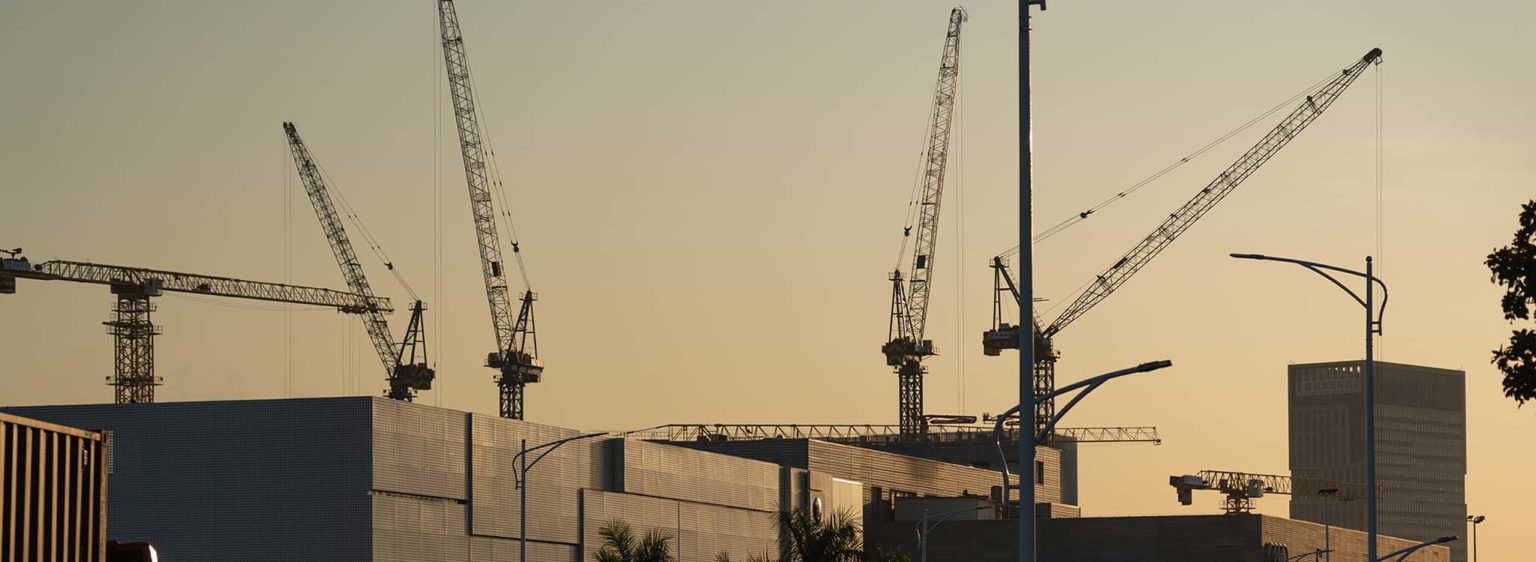
“Sustainability” emphasizes a kind of development that includes the development expectation into the design concept so as to allow the architecture to share the same breath and the common destiny with the city. Along with the general development trend of the special economic zone and to meet the needs of office and logistics expansion, the design extends the office area to the area which is originally open below. The facade is made of double Low-E hollow glass, which can prevent the outdoor heat from entering the room, and can also completely keep the heat indoors in winter, effectively improving indoor comfort.

The Urban Texture’s Steel Exterior and Candyfloss Heart
If the facade is likened to rigid design language just like containers on the quay, then the language of the interior is turned into a flexible one like the coastline that is a deeper translation of the spiritual attributes of the texture in the Greater Bay Area.
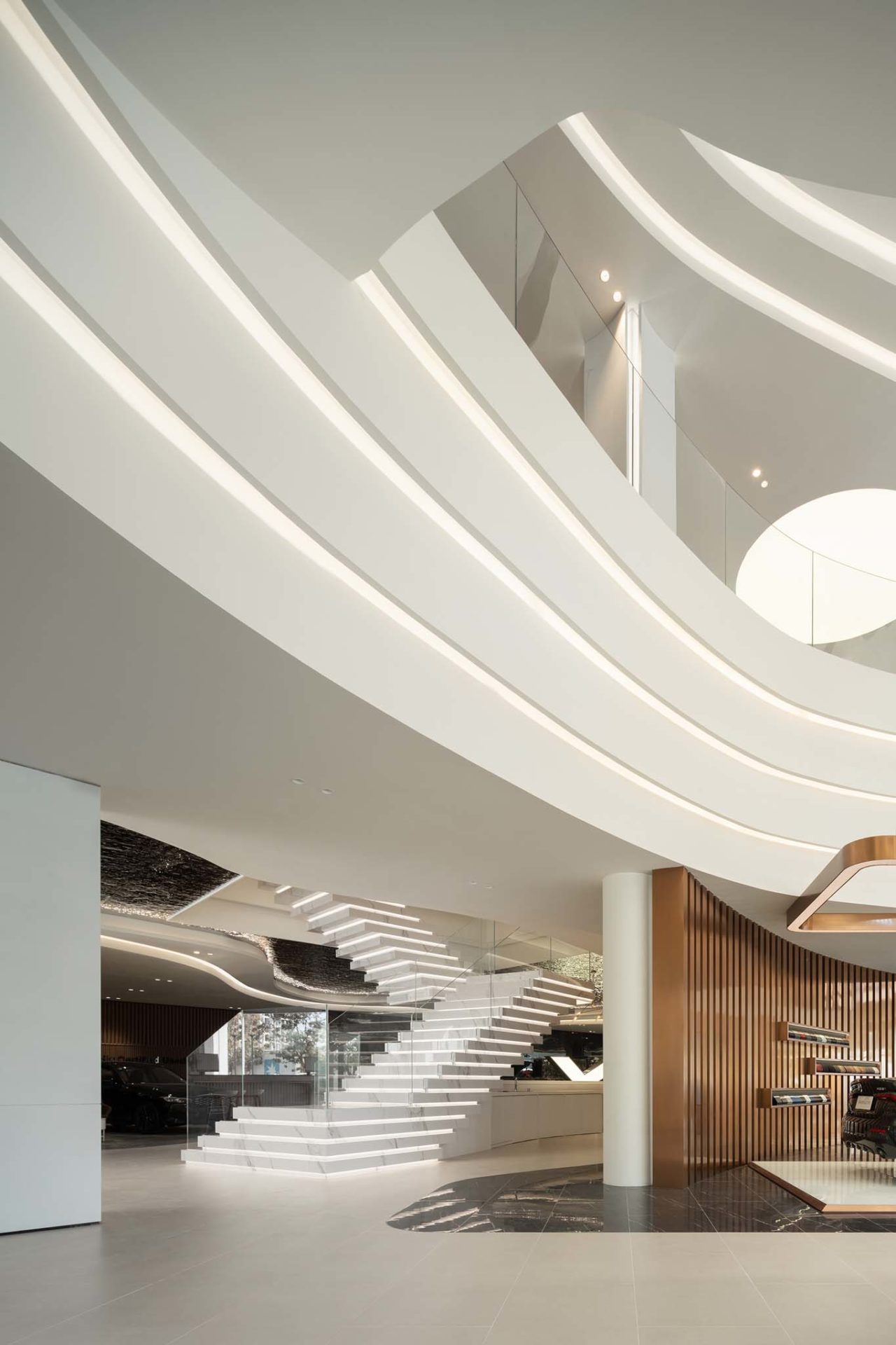

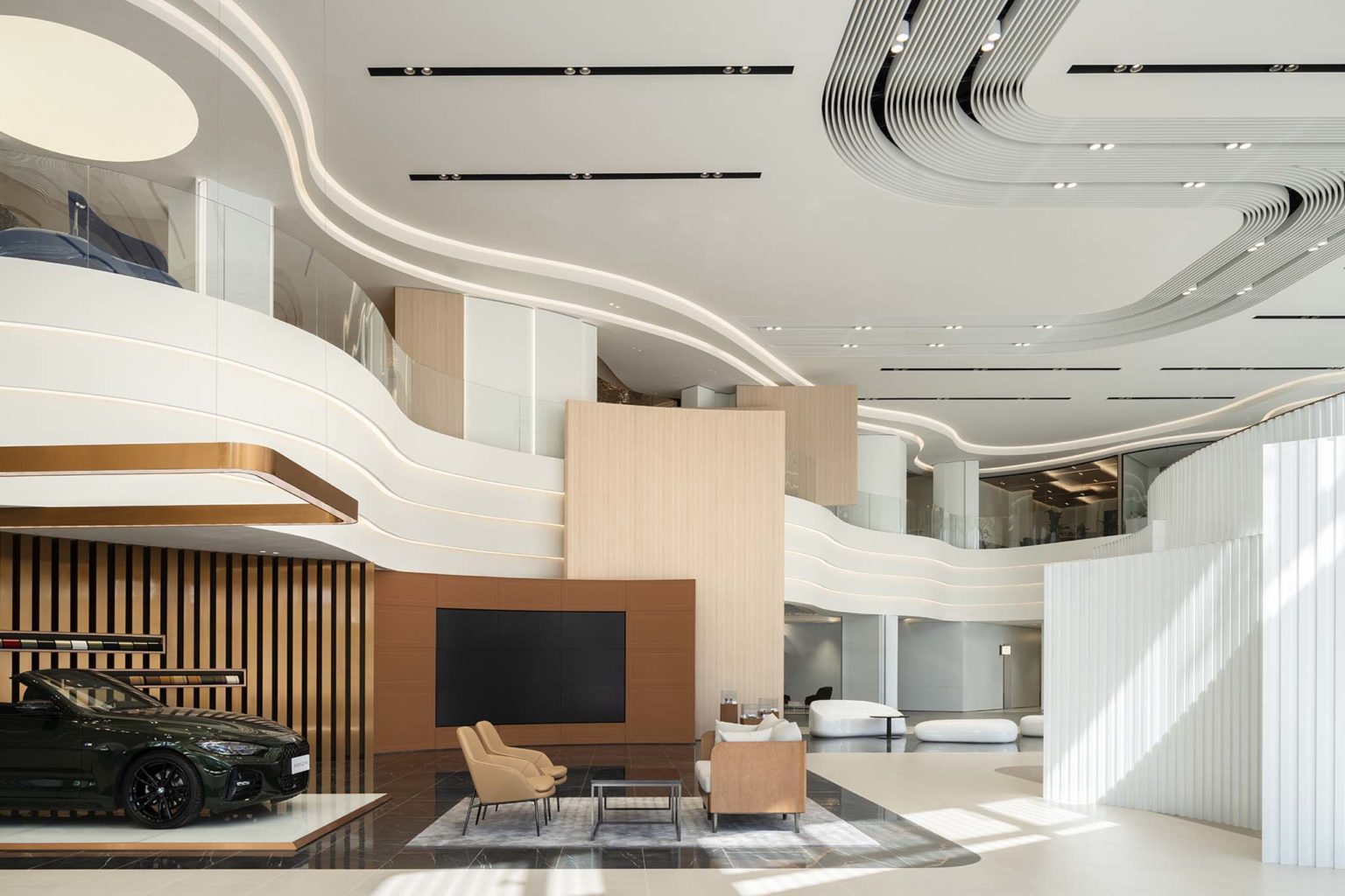
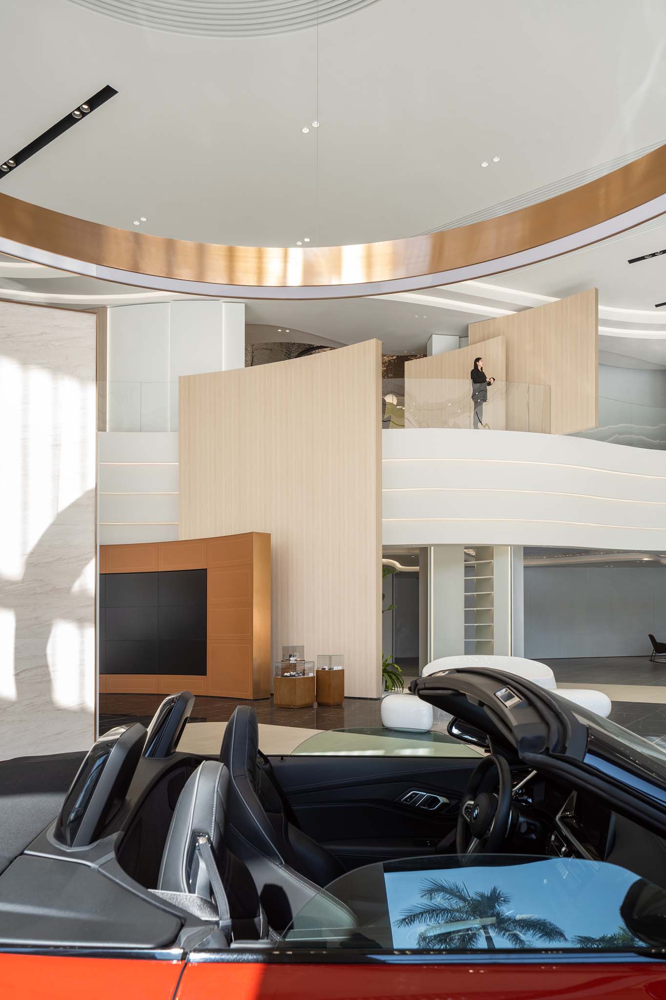
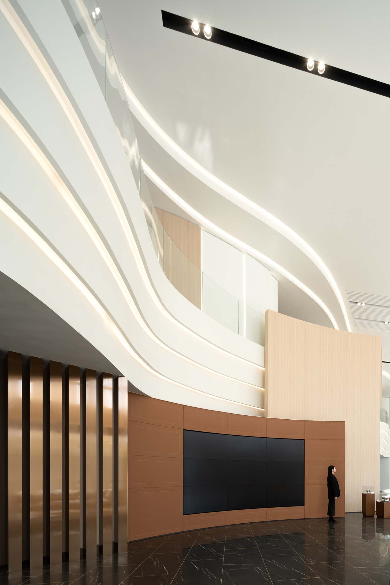
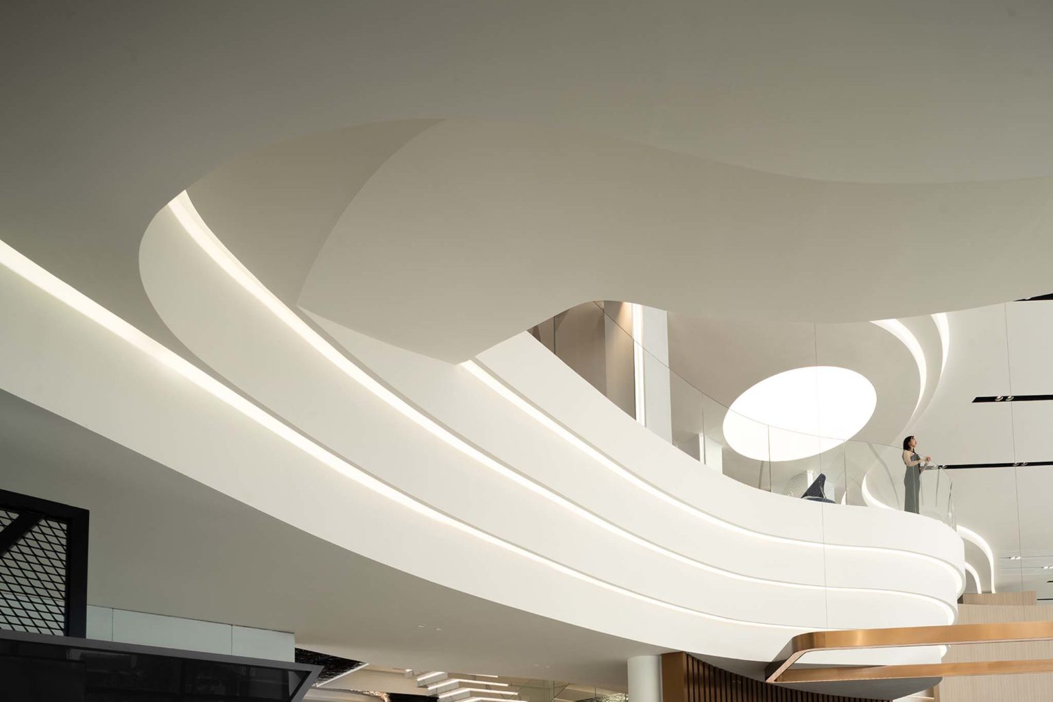
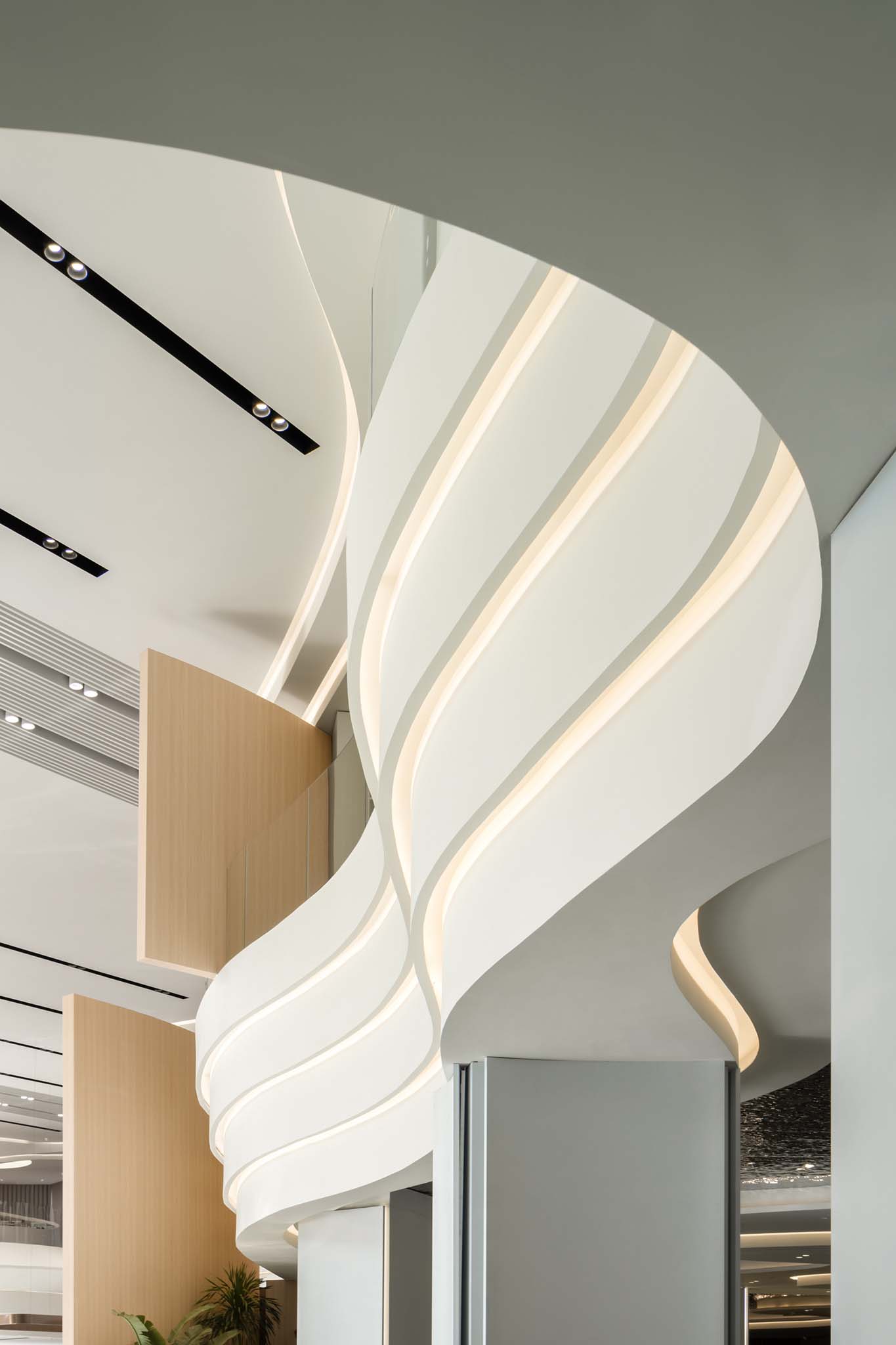
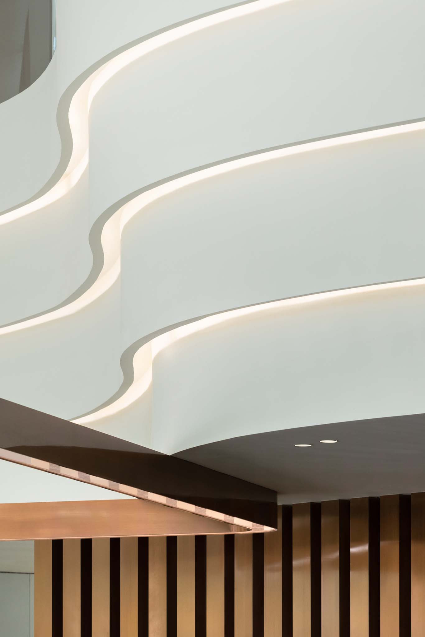
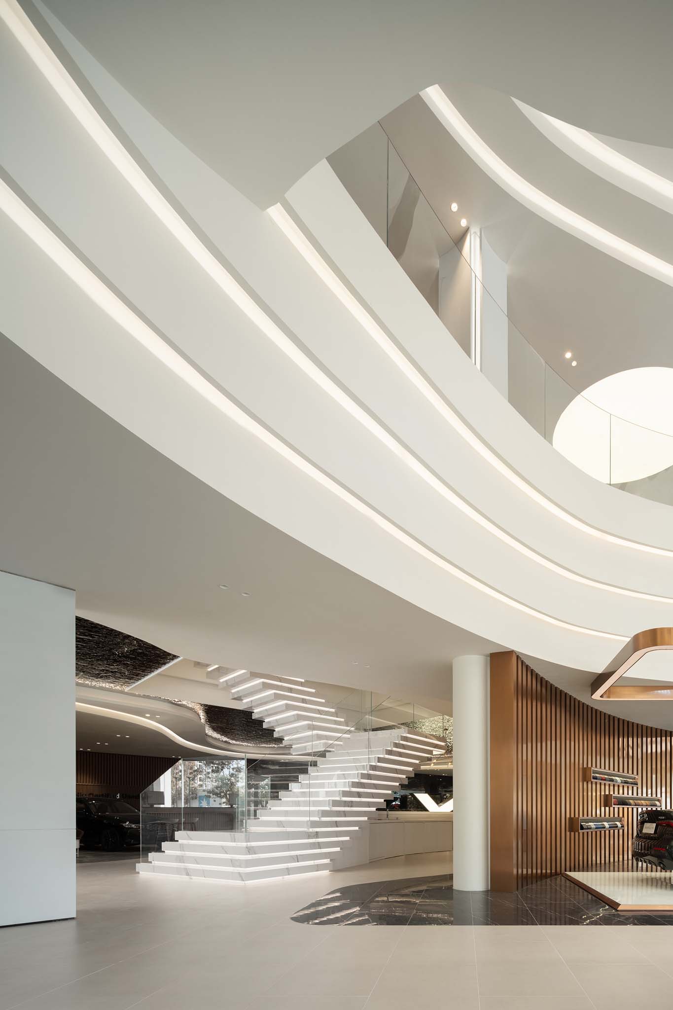
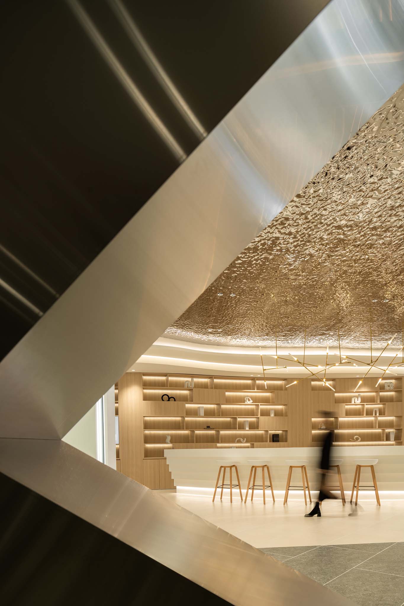
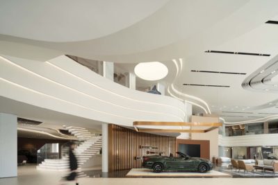
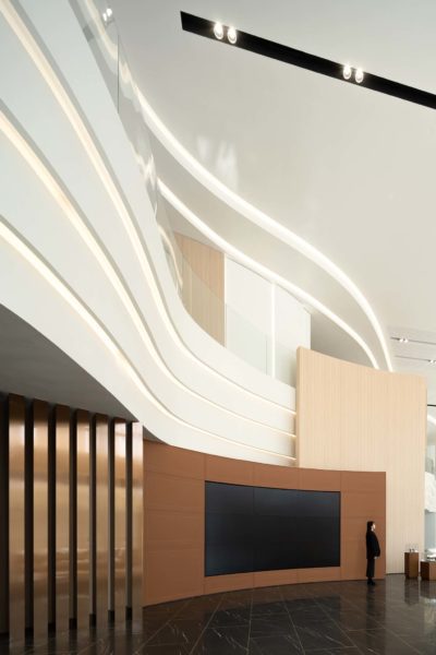
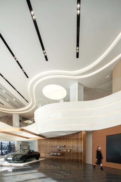
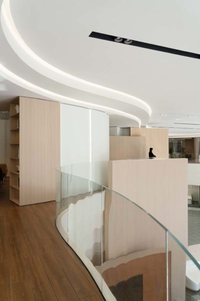
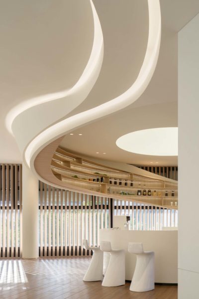
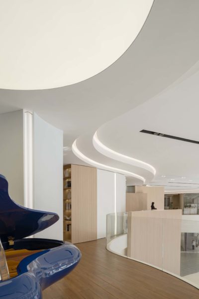
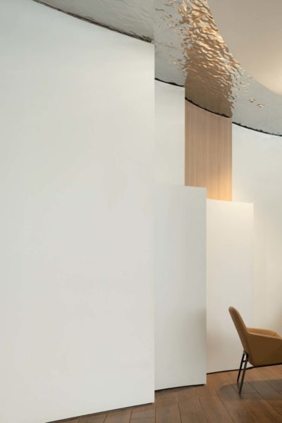
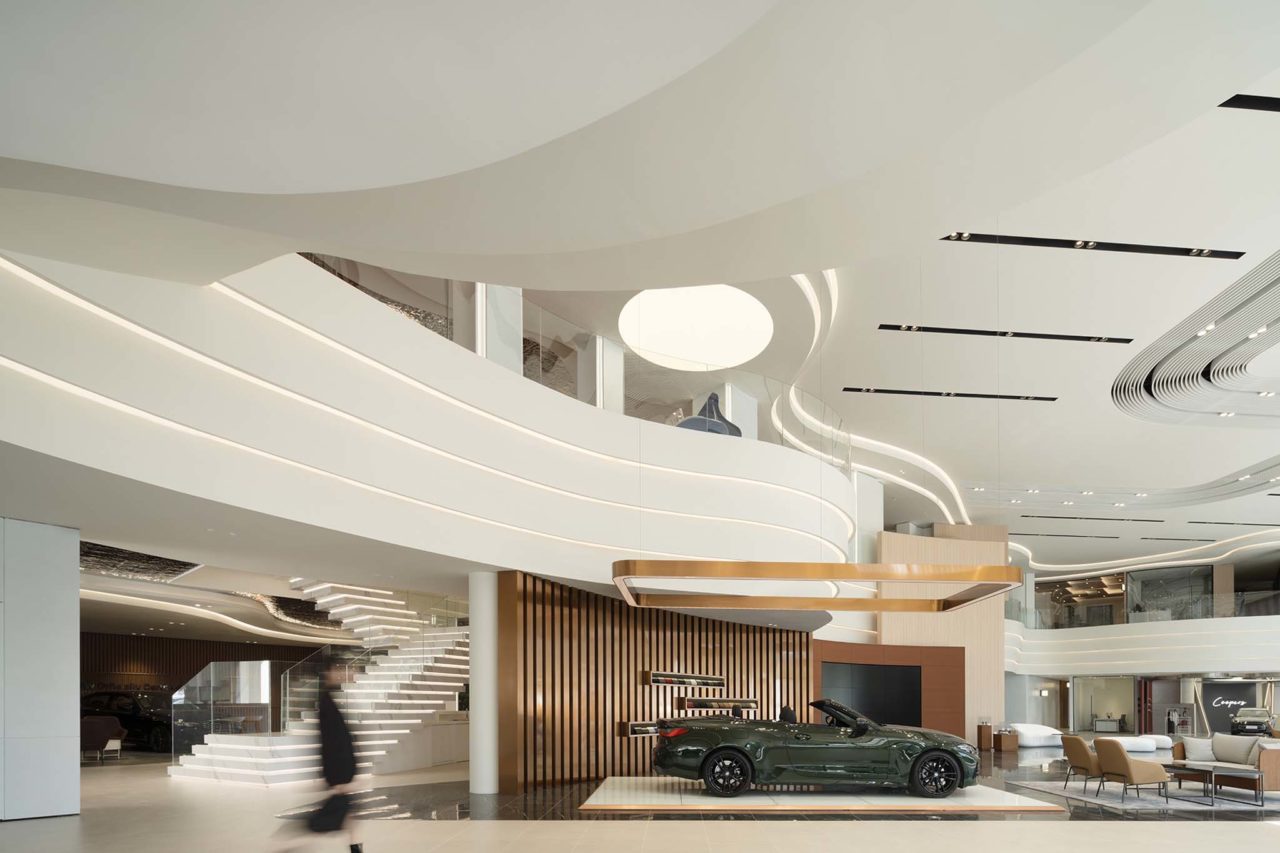
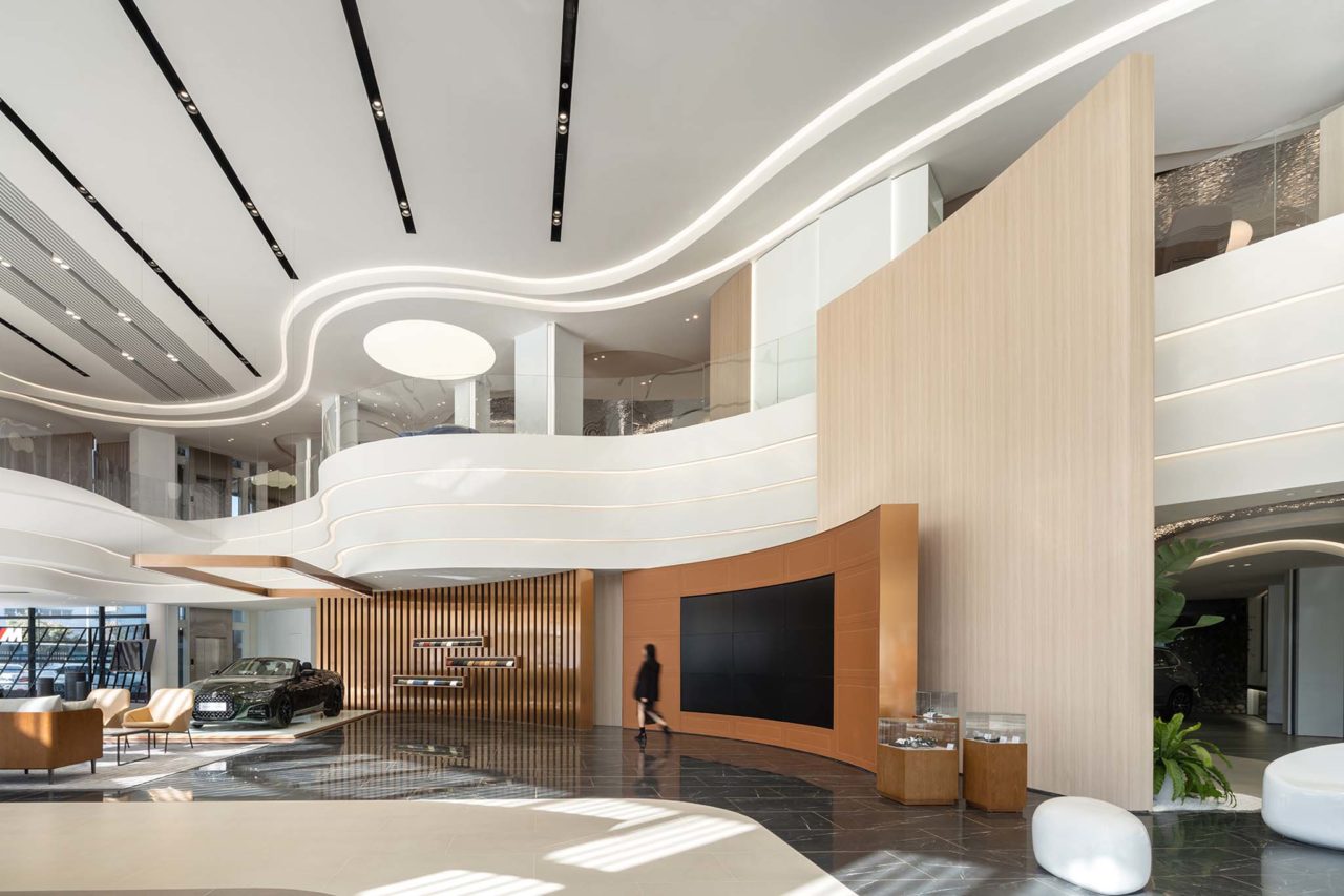
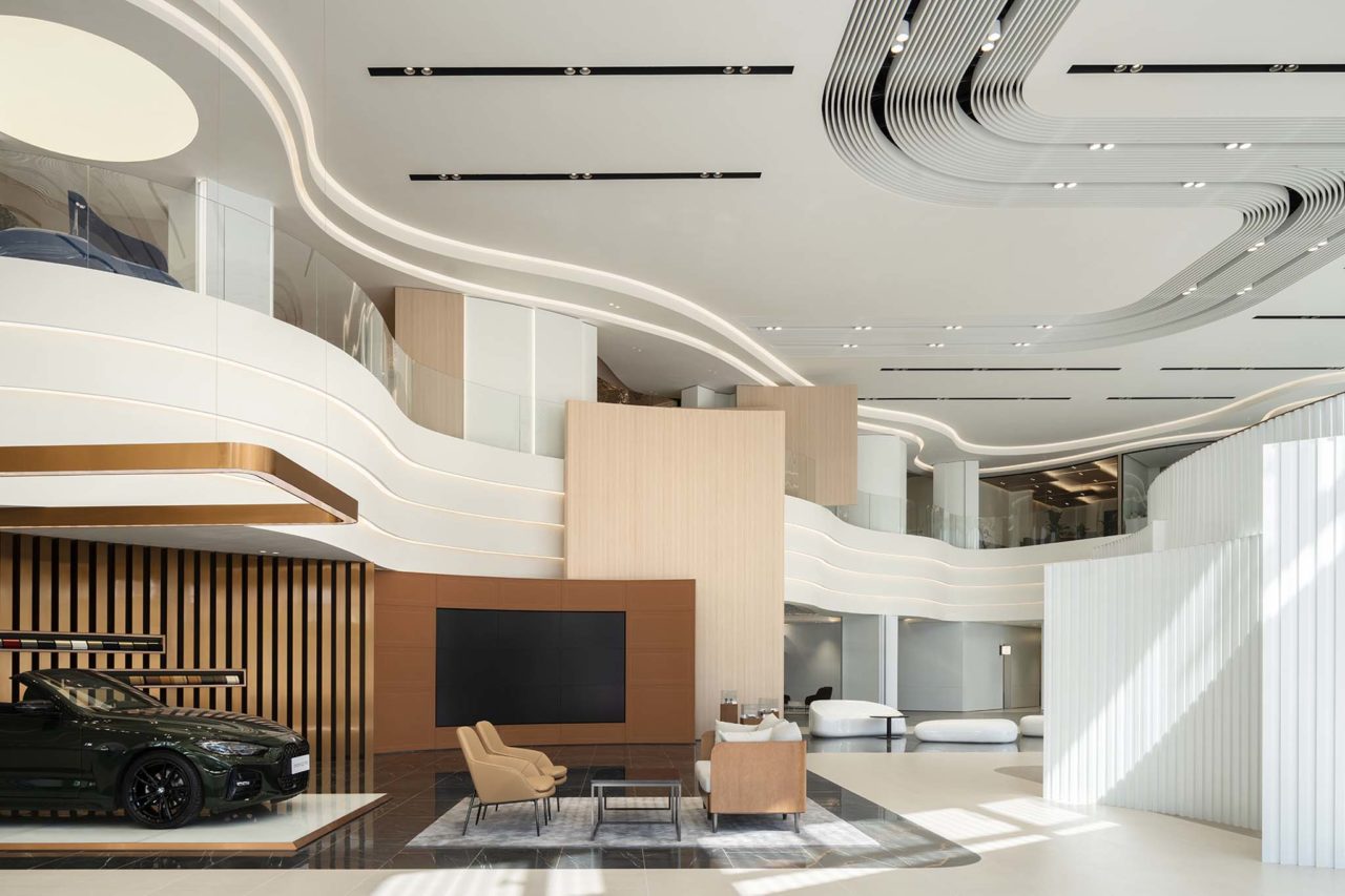
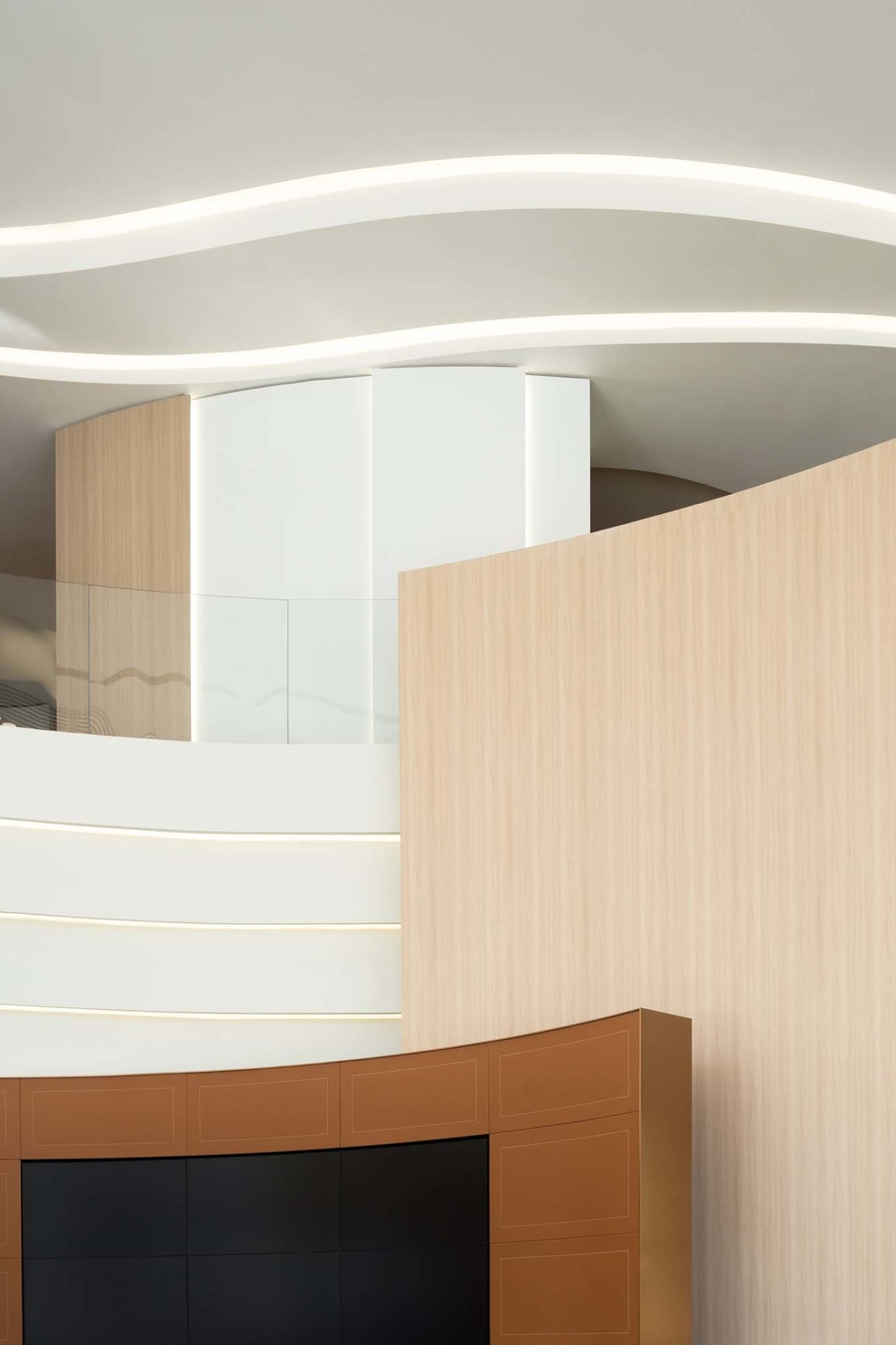
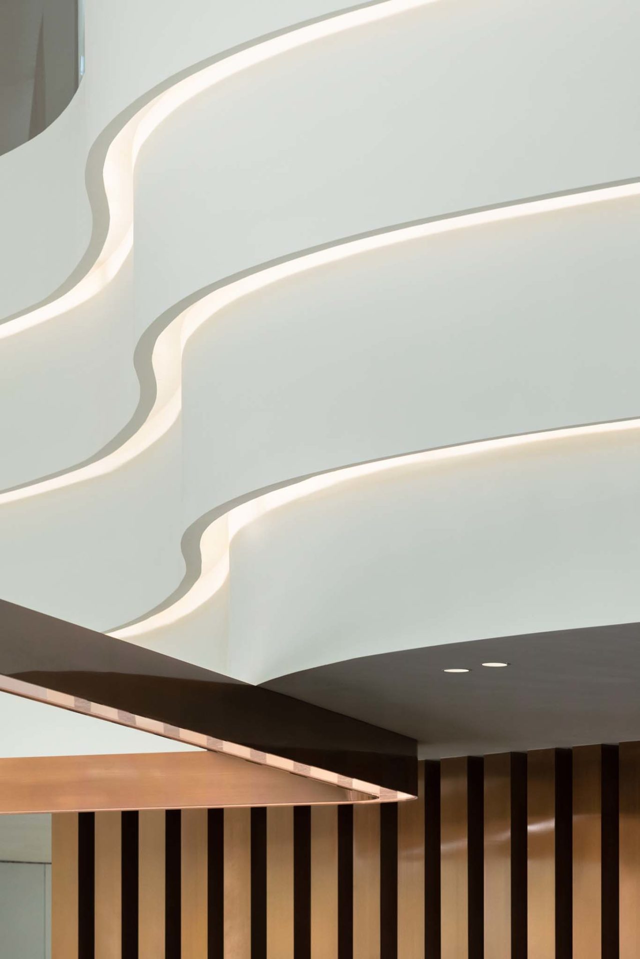
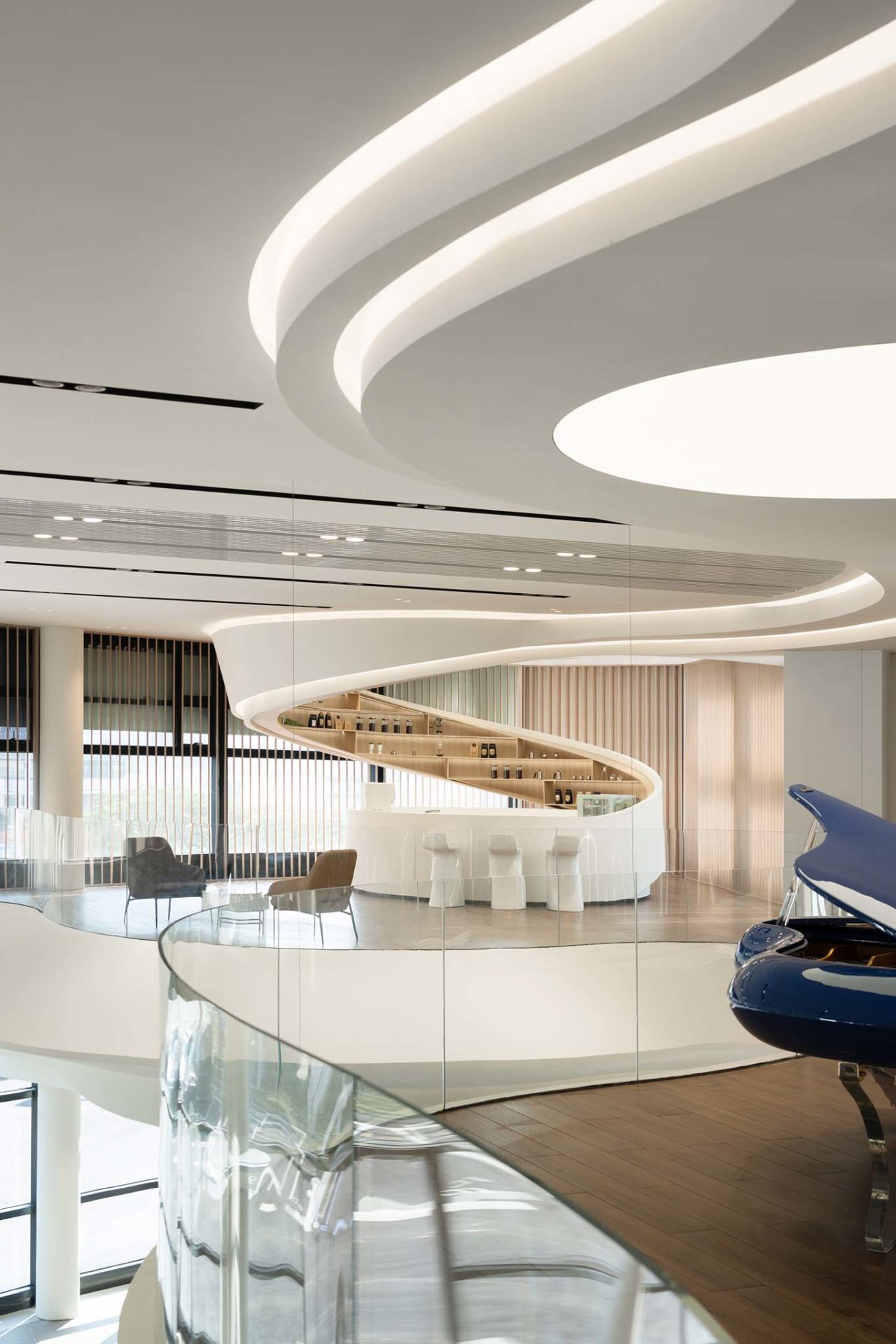
Sleeping on the waves near the ocean, the universe is in your arms. In response to the geographical features of Qianhai, “setting sail” was determined by the designers as the interior design concept in which a large number of conceptual shapes consisting of coastlines with rolling waves and creative shapes consisting of full sails would be used in space. The ceilings of the space simulate the natural radian of the sea waves and create a visual effect of stacking waves by the layers of ceilings. While arc shapes of the sails on the facade echo the surging waves on the ceiling, allowing customers to enjoy a vast landscape of the sea and sky upside down and sailboats racing.

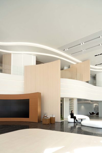
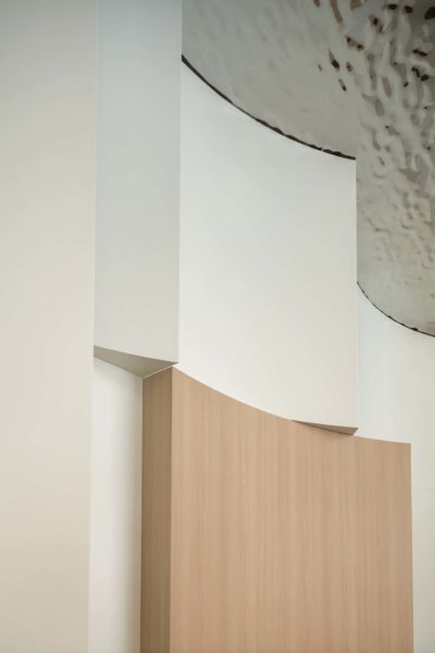
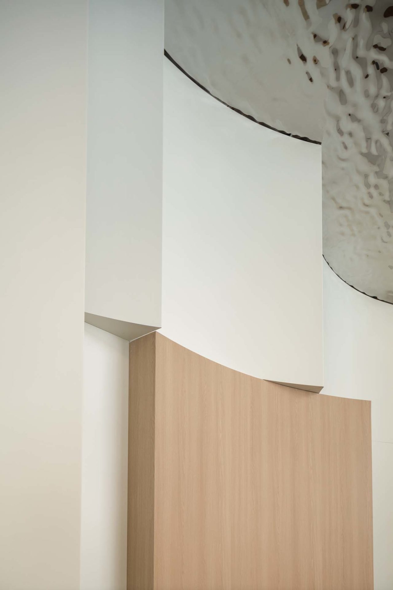
The project reconstructs the muscles and bones from the original building structure made of steel and concrete. In order to make a large number of columns on the border of the original two structures “disappear”, the designers transformed the columns into arc-shaped walls, incorporating them into the structure with sail shapes. By utilizing the floating characteristics between materials and space skillfully to blur the virtual and real boundaries of “Existence” and “Nothingness”, the question left over by the disorder of original upright columns is weakened.

Wandering the “Coastline”
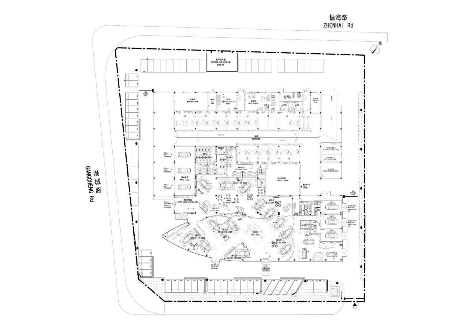
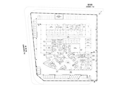
“There are no straight lines or sharp corners in nature. Therefore, buildings must have no straight lines or sharp corners.” The designers changed the “fragmented” layout of the functional areas, incorporated the meandering wavy coastlines into the spatial shapes, and strengthened the traffic flow of the interactive experience, providing customers with more freedom and comfort to “float with the stream eastwards or westwards”.


In addition, the sale traffic flow on the first floor is more distinct from the after-sale traffic flow on the second floor. The rational planning of the traffic flow effectively diverts the passenger flow, and improving service of operation also promotes the customer experience to the utmost extent.


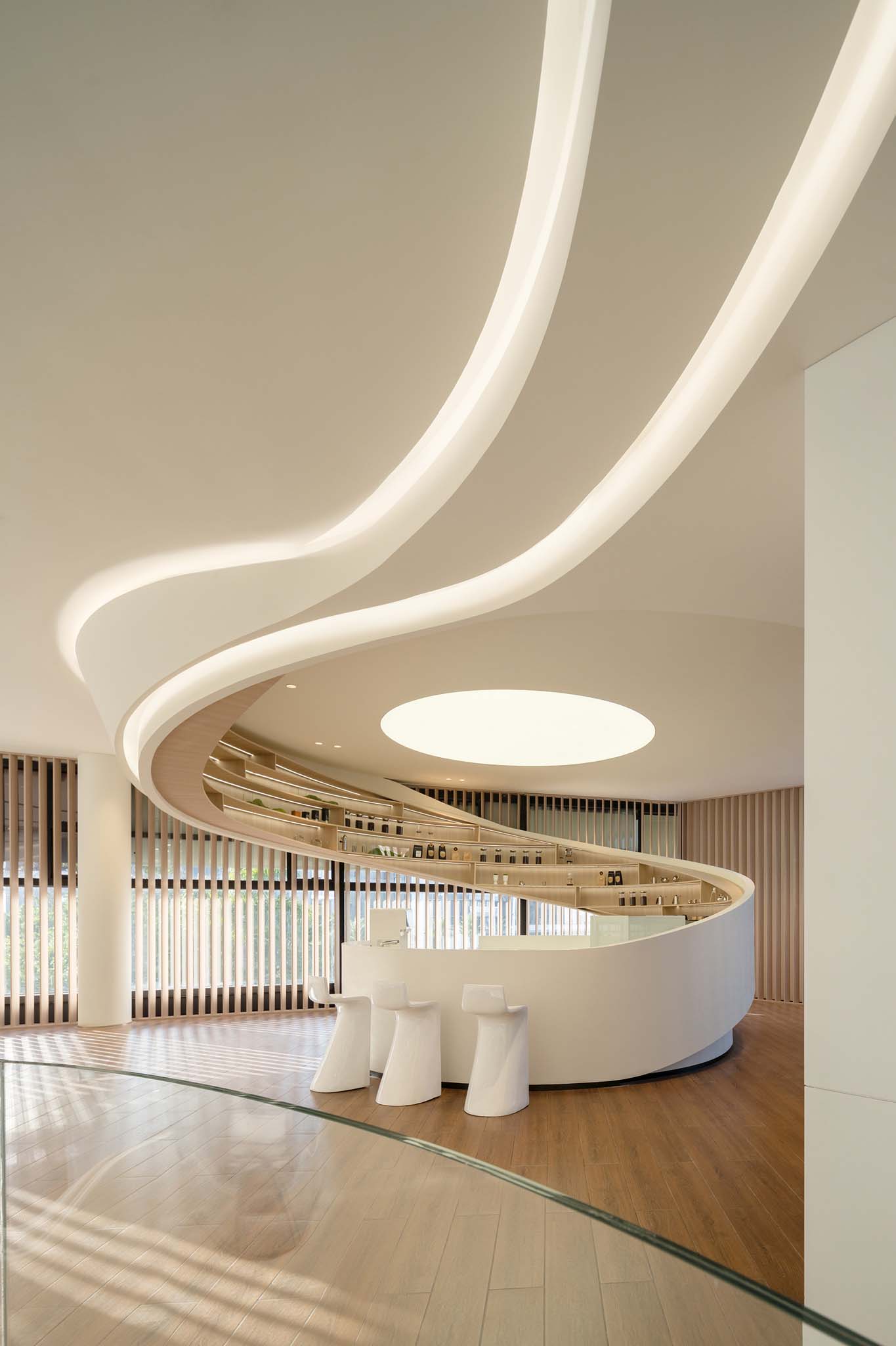
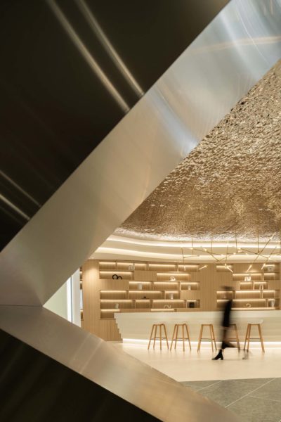
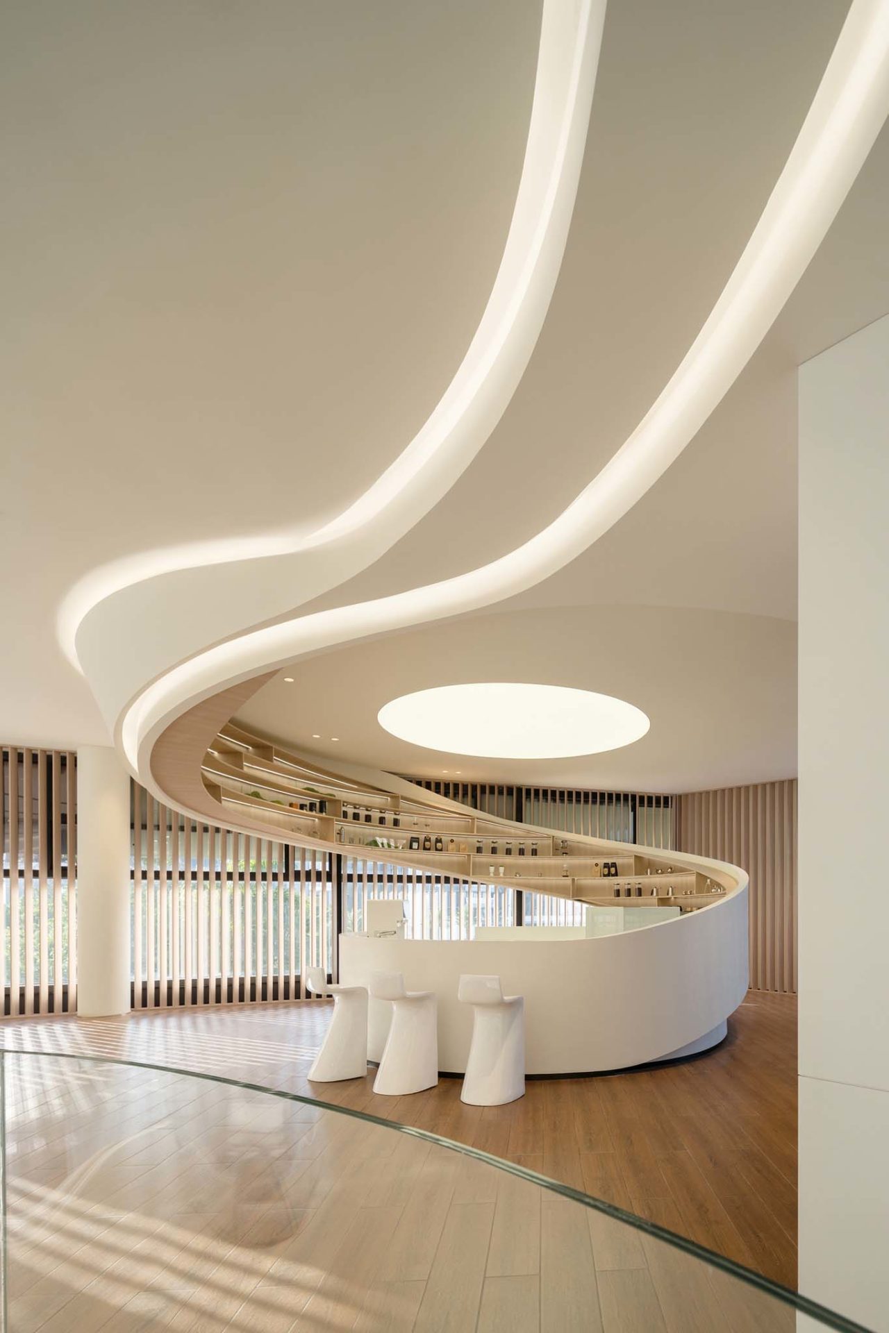
When stepping up on the stacking floating waves, the original point of the intersecting line of the sea and sky becomes more accessible. The area on the second floor is divided into a beverage bar counter and a customer rest area. The artistic bar is surrounded by wave shapes hovering and falling from the ceiling, forming a harmonious relationship with the continuous wavy wave shapes of the ceiling. The functional attribute of the beverage bar counter also implies the essential meaning of “water”. Customers sit around by the side of the bar counter, and the external scenery and daylight shine through the grille gaps into the room. The blending and vagueness of virtuality and reality based on the real framework provide the space with a broader spiritual realm.

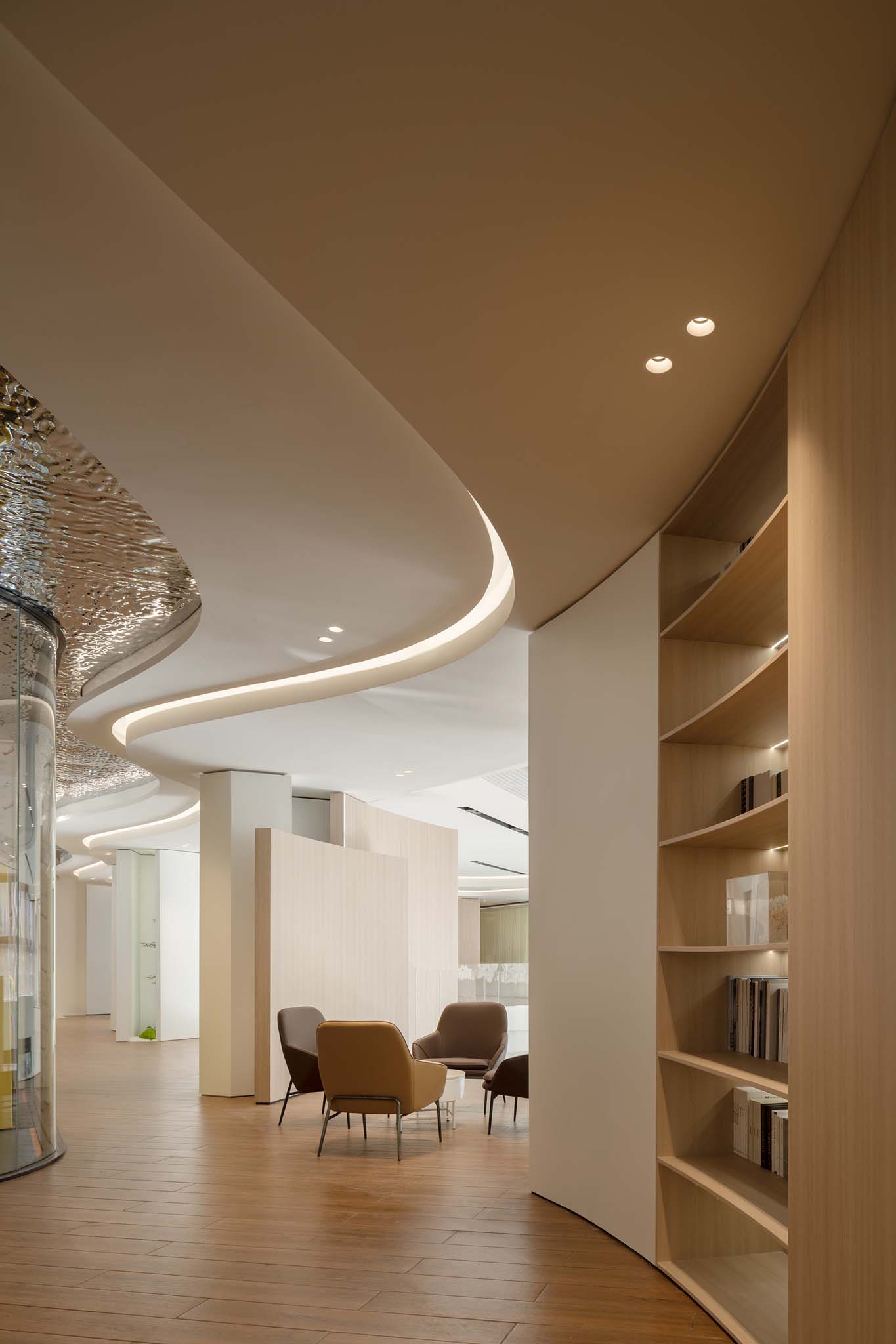
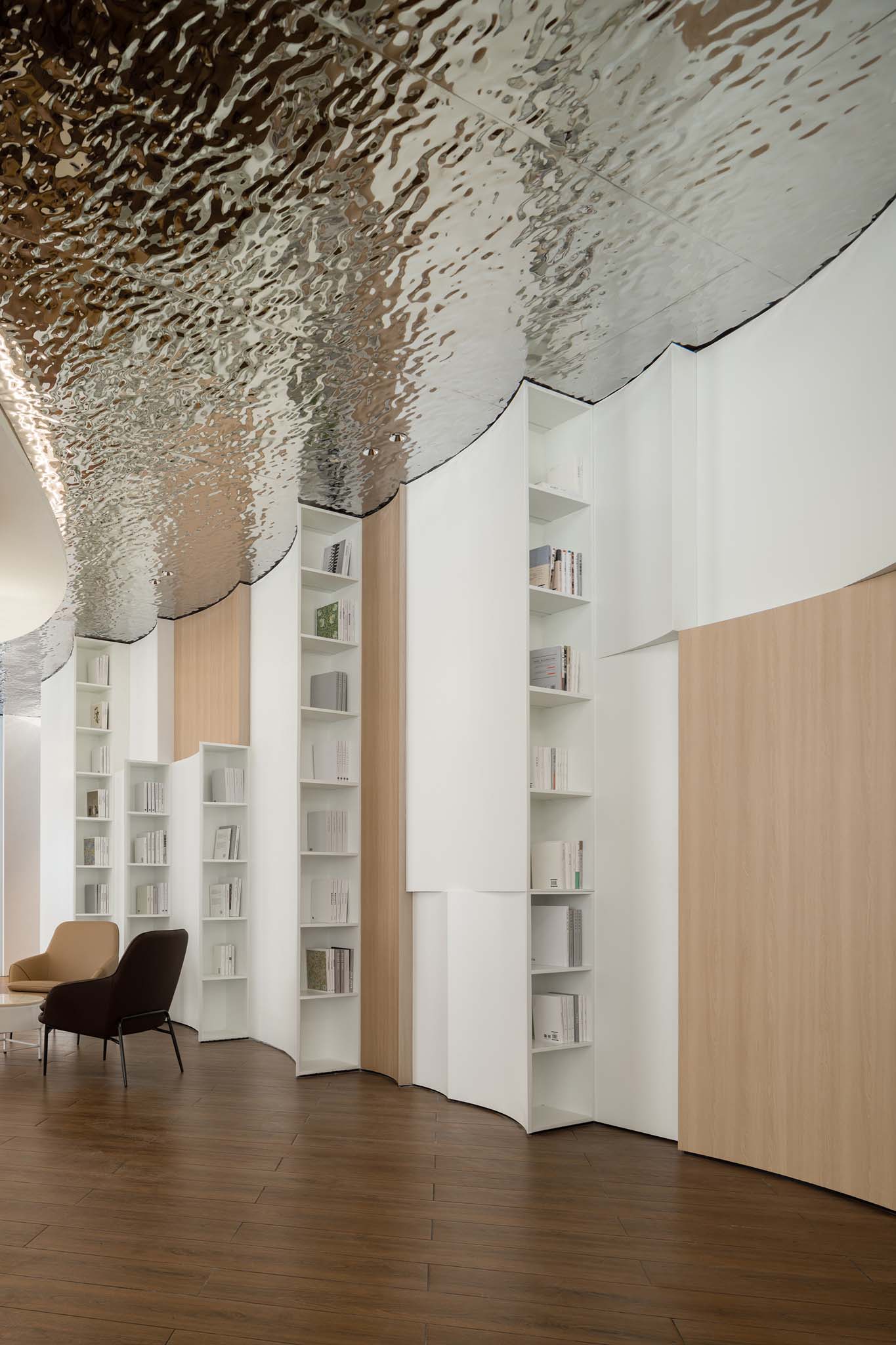
Space aesthetics is the control and triumph of designers over materials, methods, and imagination. The water ripple stamped stainless steel is used to echo the outer glass guardrail, stippling the unique agility and clarity of “water” in the tasteful and tranquil pure white foamy waves, presenting a sparkling waterscape like “the rolling waves glitter like gold and silent shadows in the water glimmer like jade”.

The entire leisure area is skillfully divided by bookshelves, allowing customers to enjoy themselves without being disturbed, either finding a quiet place to take a nap or reading at will, or gazing freely at the distant view.

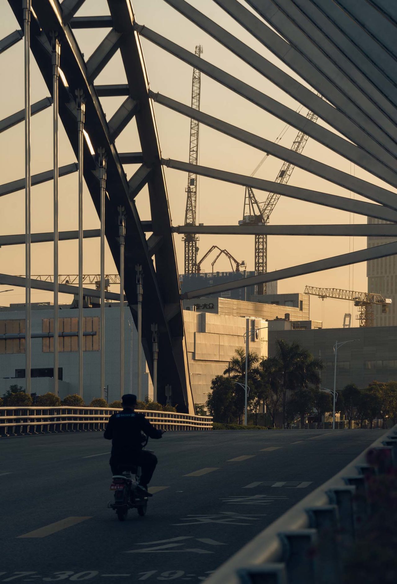
When the night takes away all the heat and clamor of the day and the sunset glow ripples with the last trace of beauty in the building with both steel exterior and candyfloss heart, lights scattered on the facade will light up, responding to the crisscrossing streamer of car tail lights under a slow speed shutter. The metabolism of a city is just like the change in the four seasons and the alternation of night and day. And with the sustainable design concept, the spirit and body of the Greater Bay Area of Qianhai are converged into the grand vision of the Special Economic Zone to build a future city.







The project description is provided by the designers.
About the Designers

“Undefined” is the self-definition of ARCHIHOPE LTD.
With the vision of “Building a Common Hope” as its development vision, it adheres to pursuing multi-dimensional design solutions which will be constantly redefined with new experiences. At the same time, it advocates the design idea of making full use of space, creating visual innovation and new user experience. The business scope is not limited to the domestic, nor to the architectural design, interior space, and landscape design of commerce, office, and hotel. It is thought highly of by customers in a number of projects, with numerous awards in the professional field at home and abroad.
